INTESTA – A NEW FEATHER IN OUR CAP.

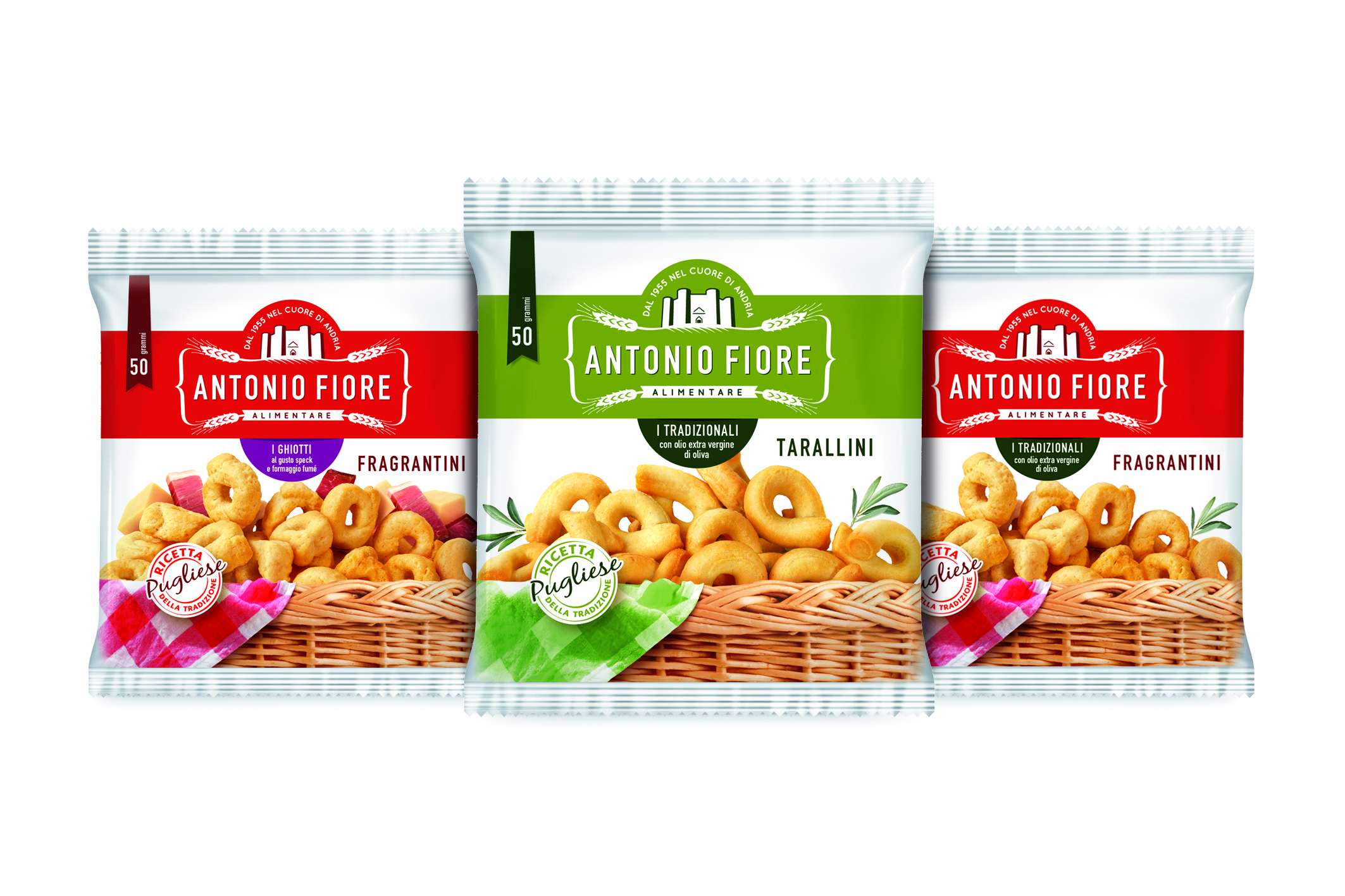
Antonio Fiore Alimentare has been producing Taralli pugliesi crackers since 1955. They entrusted InTesta with the repositioning project, using a new brand image and a new system pack.
The agency of the Armando Testa Group specialises in graphic design and packaging, and they studied the image of the Andria-based company, starting off from the new logo.
Antonio Fiore presents itself today with renewed font and symbol: a quality crest aimed at confirming the value of its products, the natural origin of the ingredients and the brand’s attachment to its local territory. The identity project has also been backed up with complete restyling and rationalisation of the packaging.
The new image is thoroughly revised and aims at using up-to-date visual language to convey the tradition and the quality research inherent in the product. The white background echoes simplicity and transparency; the top view brings to mind the moment of the preparation of the recipe and how genuine the ingredients are. Finally the taralli are the stars of the image and the brand identity. Positioned in a very close-up, they highlight the goodness of the finished product.
The decision to create such a well-defined and communicative graphic line was a direct response to the need to describe the tradition, the simplicity, the variety of flavours and the quality of a product which guarantee its excellence.
The product range, now with a standard design and language is present in mass markets and vending channels. Its mood is decidedly modern, its image is fresh and the new communication style bears the signature of Antonio Fiore.


