IEO: thirty years projected years into the future with AT Design
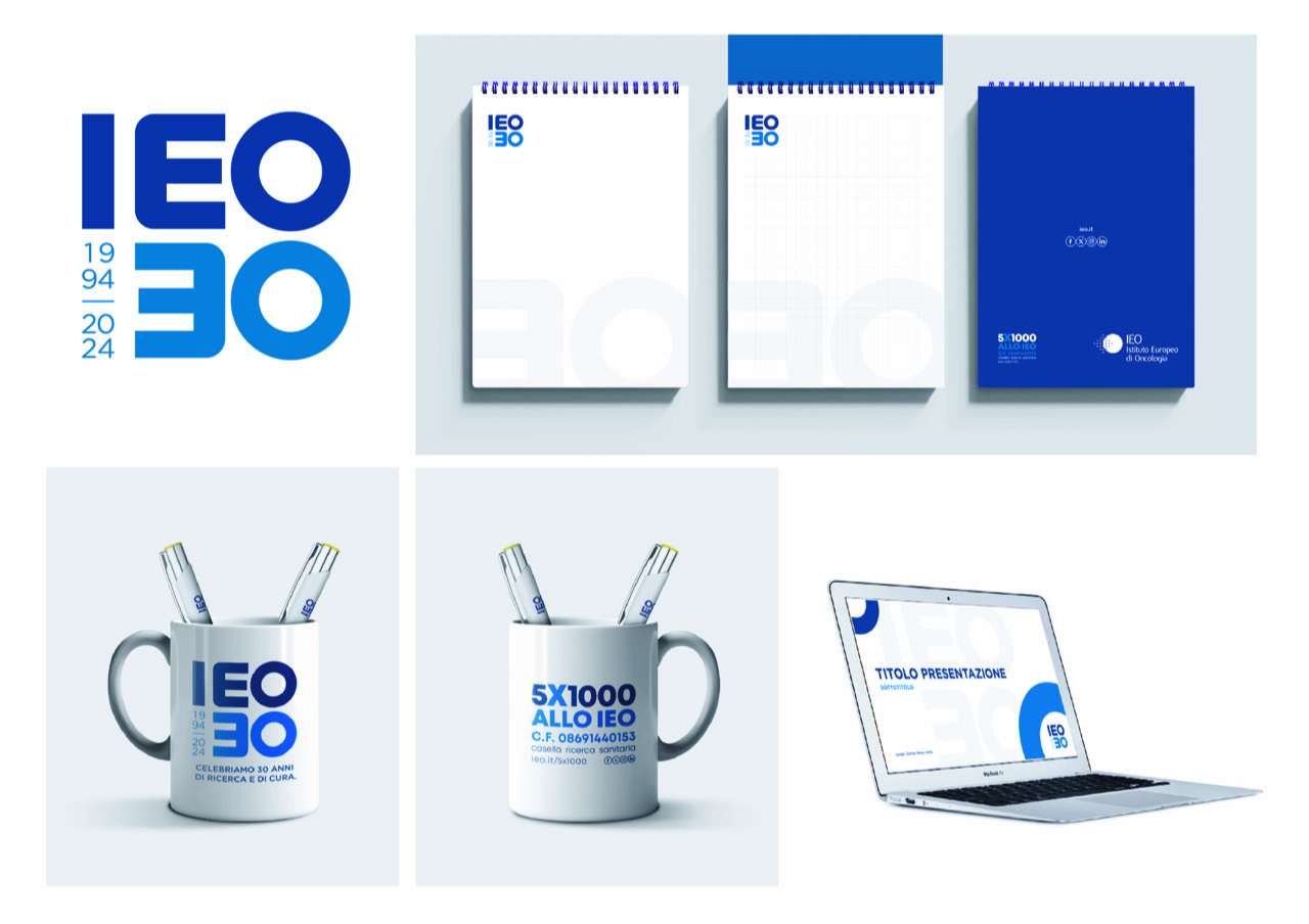
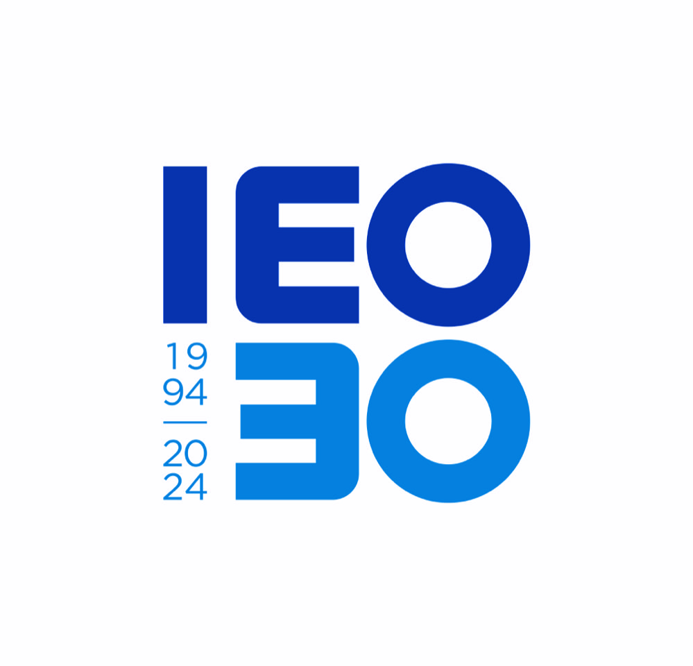
AT Design, the unit in the Armando Testa Group that specialises in branding and design, has created the logo to celebrate thirty years of activity of the Istituto Europeo di Oncologia.(Europenan Oncology Institute).
This linear design is full of meaning, encompassing all the history of research, the cutting edge technology and the pioneering vision of the Institute.
The agency devloped lettering which is incisive yet at the same time smooth, to make the link between the IEO and its thirty years.
Using a forward moving projection the IEO acronym is reflected in the number 30, creating a shape that conveys strength and authority. The mirrored letters allude to the important standing the name of IEO enjoys in the scientific world and the prestige the Institute has attained over the course of these thirty years.
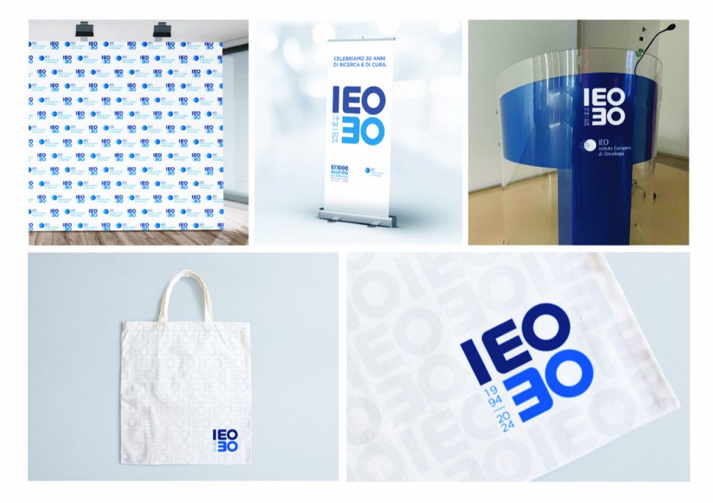
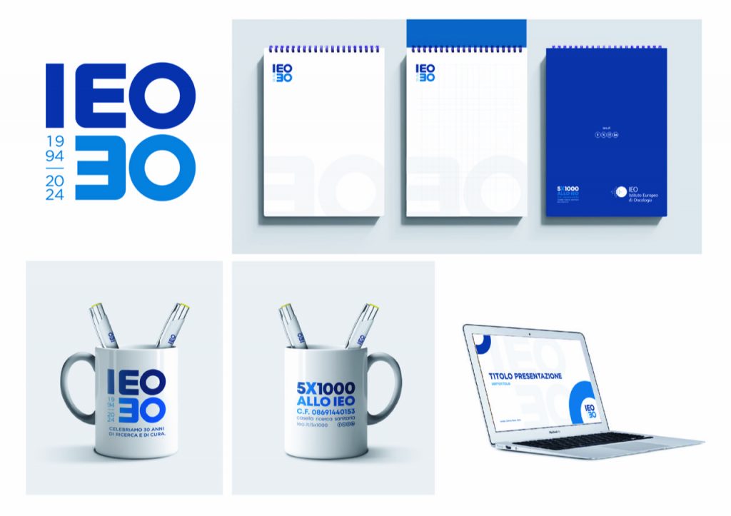
This logo will be part of the Institute’s online and offline communication, alongside the institutional logo for the whole of 2024 and be featured on all the initiatives planned during the year.
CREDITS:
Creative Director: Roberto Gresti
Copywriter: Delia Laviola
Client Service: Carlotta Paterlini
