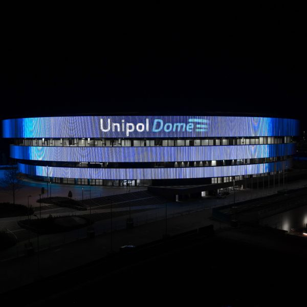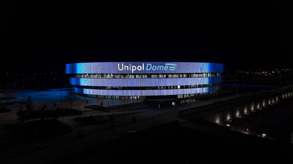
Armando Testa Design, the unit in the Armando Testa Group which specialises in branding and design has been recruited by Unipol to design the logo of Unipol Dome, the new venue in Milan, dedicated to entertainment and sport.
The building was designed by the international firm of David Chipperfield Architects and ARUP, and it is destined to become one of the city’s go-to points for concerts, big events, and sporting competitions.
Unipol has signed a 10-year agreement, in the capacity of title sponsor, with the CTS Eventim group, a German multinational which owns the property.
In this context, AT Design has developed a logo transforming the distinctive architecture of the structure into a graphic design.
The logo was inspired by the three concentric bands that emphasise the volume of the building. The structure gradually opens upwards, creating a continuous dialogue between the space, light and the city.
These architectural features, covered by an LED system to project visual contents, have become a distinctive and recognisable trait in the logo, with fluid lines and a gradient inspired by the corporate blue of Unipol providing a graphic reinterpretation.
The result is a dynamic and contemporary logo, created to express solidity and movement, technology and emotions all at the same time. This is an image which can anticipate the immersive experience the Unipol Dome offers, transforming the building into an urban icon and a communication platform open to the city.
Credits
Agency: AT Design
Creative Direction: Roberto Gresti
Creative team: Vittoria Fava, Dario Trigiani
Head of client service Milan: Emanuele Cicogna Mozzoni
Caffitaly is an Italian company which specialises in the production of high-quality coffee machines and capsules for coffee and hot beverages. They have now chosen the Armando Testa Agency for their corporate and promotional communication.
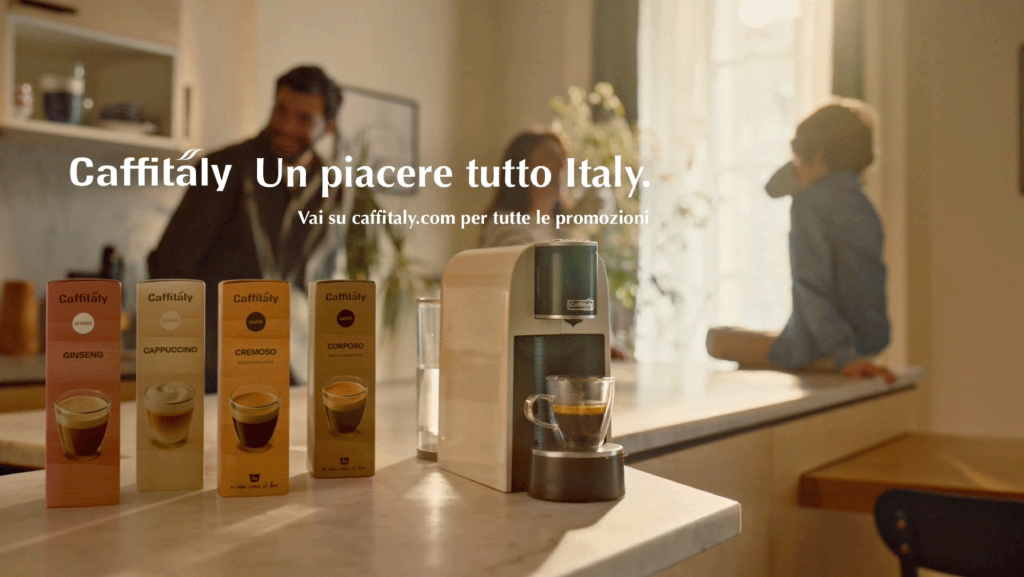
The challenge facing the agency is to promote the brand’s all-Italian excellence and experience, long distinguished for innovation, quality in the cup, and the wide range of its offer. Its capital is built on the patented Caffitaly System technology and unique features, such as 8 grams of coffee in each capsule (the ideal dose for a true espresso just like at a coffee bar) and the multi-beverage system with a wide selection of coffees and top-quality hot beverages, designed to satisfy consumption whatever the time of day.
Over time, the collaboration will involve all the main ATL, BTL, and social assets, already at the end of March, it featured the launch of a promotional campaign on social media and in single-brand stores to communicate the “Spring Promotion”, dedicated to the new mustard coloured Limited edition of the iconic Volta machine, and also to the new machines made with 65%second-use plastic, fully recyclable packaging and energy saving technologies.
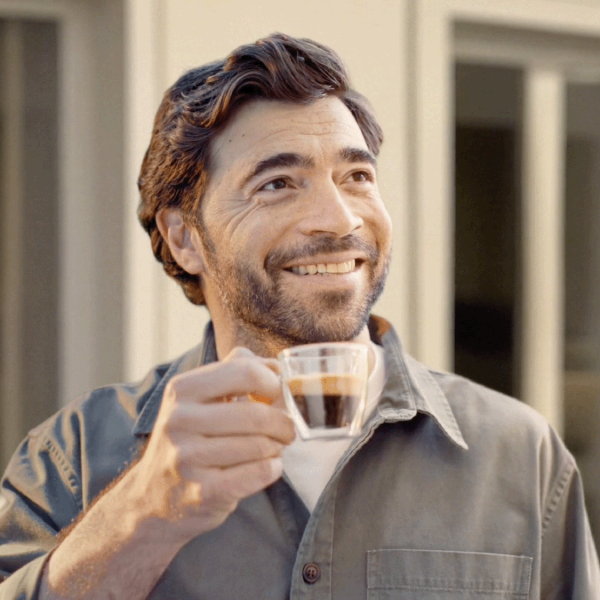
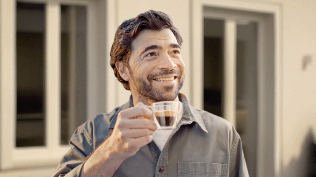
In addition, the new corporate TV ad has been on air on TV, digital TV and social media channels since 3rd May. (Link YT: https://youtu.be/SLSfL5QevhM). The aim is to highlight and reinforce all the strengths of Caffitaly offer. In the idea, created byArmando Testa and produced by AT Studios, we see a man at home, preparing an excellent espresso. No sooner has he stepped out onto the terrace to enjoy it peacefully, than all his neighbours from the surrounding houses are attracted by the aroma and they place their own “orders”, exactly as if they were at a bar. The ad closes with the campaign claim “Caffitaly, un piacere tutto Italy” (Caffitaly, an all-Italian pleasure) which plays on the brand’s name with a sudden code-switching and an ellipsis that becomes an expressive licence to underline in a more than colloquial manner the all Italian way to enjoy the moment of having a coffee or hot drink and turning it into a social occasion.
Media planning was managed by Media Italia, a partner who was already alongside Caffitaly, with the goal of ensuring an even better integrated process involving creativity and media.
“The collaboration with the Armando Testa Group forms part of Caffitaly’s growth and consolidation journey. During a period when the market is constantly evolving, we want to strengthen the brand’s positioning by enhancing our strategic assets with even greater effectiveness: technological innovation, quality of the choice, breadth of range, and ability to interpret new consumer needs,” comments Andrea Zocchi, CEO of Caffitaly.
«We are happy to start this collaboration with such a valued creative partner as the Armando Testa Group. For Caffitaly this represents an important step in the brand’s development and in our dialogue with an ever wider and more diverse audience. – explains Marta Colombo, CMO of Caffitaly. The concept interprets our positioning in an effective way and describes that very Italian pleasure of enjoying top quality coffee and hot drinks at home just like at a bar».
What makes a real difference in research, is a contribution from everyone.
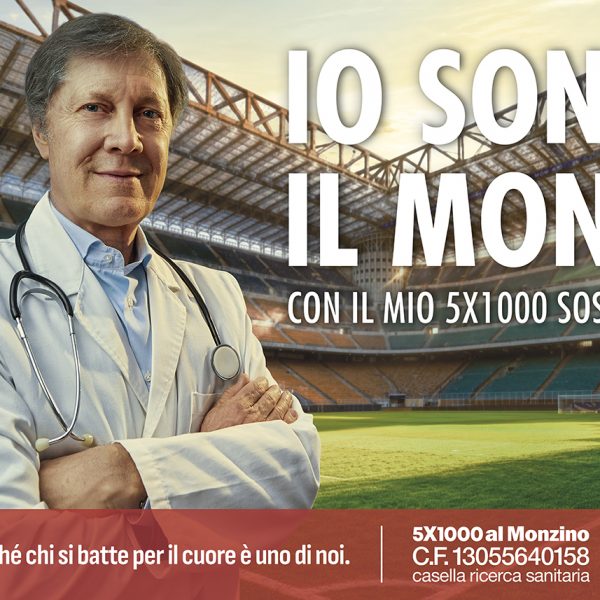
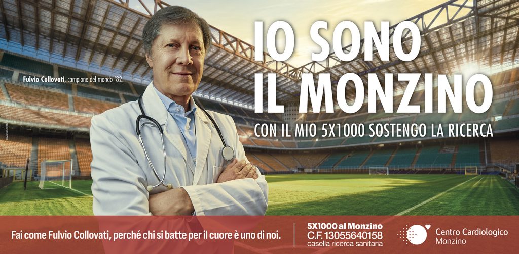
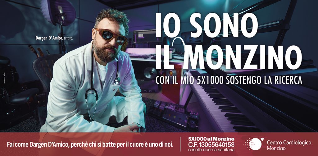
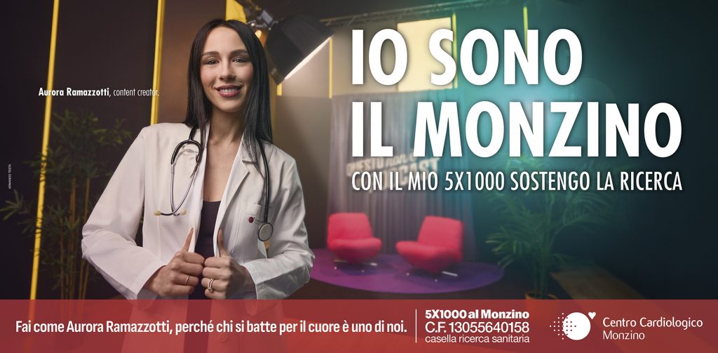
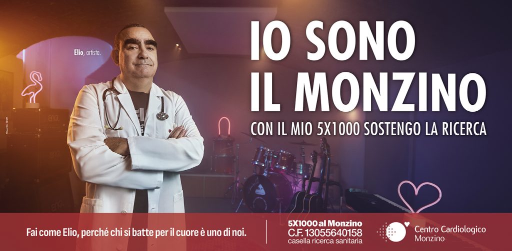
That is the underlying premise behind the new 5×1000 campaign created by the Armando Testa agency for the Monzino Cardiology Centre, a reference point in Italy in the fight against cardiovascular diseases.
The campaign is fronted by four faces that are very well known to the public in Milan and also nationally: content creator Aurora Ramazzotti, 1982 world champion Fulvio Collovati and artists Dargen D’Amico and Elio. Four exceptional ambassadors, donning lab coats and stethoscopes – they have decided to symbolically join the Monzino cause.
“I am the Monzino” is the title of the campaign: a declaration that conveys a strong sense of solidarity and belonging, and this year it extends a hug out to anyone who decides to donate. Because supporting research really means being part of Monzino.
The campaign closes with the message: Whoever fights for the heart is one of us.
The campaign was created by the Armando Testa agency, with photography by Paolo Tresoldi. The campaign is planned from May to September and includes press, outdoor, bus shelters, trams and dedicated content on the brand’s social media channels.
Production Company AT Studios, media planning managed by Media Italia.
To mark its restyling, the “Stella” brand is introducing four delicious Italian-style paninis for the summer, perfect for lunch or a tasty, practical snack.
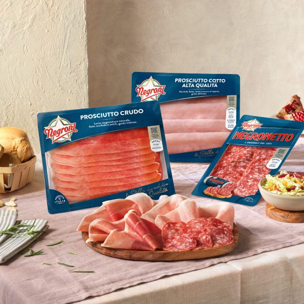
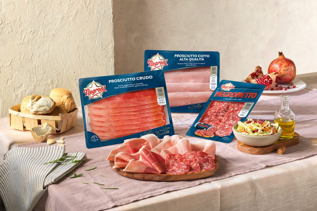
A new system pack, a refreshed visual identity, and a distinctive positioning for the Negroni cold cuts range placing the iconic Stella centre stage: the brand tells the story of how its identity has evolved with a project that combines its century-old heritage with contemporary language created by AT Design, the Branding & Design unit of the Armando Testa Agency.
At the heart of the restyling— available in all points of sale starting from the end of April—is a dialogue between past and future. The shapes and colours that have moulded the history of the iconic Negronetto salami have been revived today with a clean, modern layout, characterized by a deep blue that marks a return to the brand’s visual roots. Indeed, this colour not only recalls the brand’s historic packaging, but also becomes the background for the Negroni Star. The choice of this colour and structure transforms the packaging into part of the storytelling, and continues the concept of the new campaign “La tua Buona Stella,” (Your good star) created by Armando Testa.
The transformation is completed by the claim introduced on the packaging, “La Stella che significa Qualità,” (The star that means Quality). More than a mere logo, it is a real promise, a tribute to the Negroni legacy and the excellence of the goodness, unchanged over time. The Star is the starting point of all communication assets, and is now transformed into an even more unique and ownership symbol.
The rebranding project is naturally extended to the points of sale, creating a visual experience that uses the brand’s colour, look & feel, and iconic jingle that create a virtuous journey inviting customers to follow “La tua Buona Stella” right to the shelf.
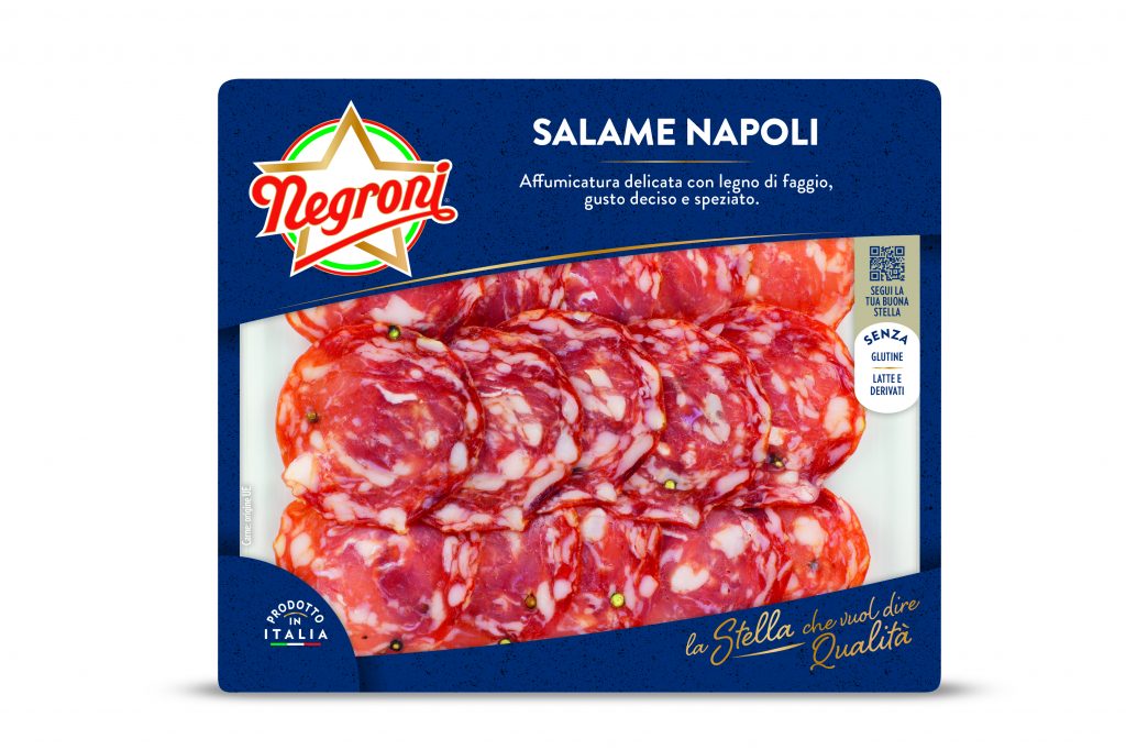
During the restyling, Negroni is also expanding its offer with a new product: Pre-sliced Napoli Salame. Inspired by Neapolitan tradition, the selected meats and smoking process before curing, enhancing its intense and spicy flavour, are what makes it so distinct.
FOCUS – THE 4 SUMMER PANINIS ACCORDING TO THE STELLA BRAND: 4 DELICIOUS COMBINATIONS WITH NEGRONI COLD CUTS FOR QUICK AND TASTY SNACKS OR LUNCHES
As summer approaches, our desire for practical recipes without sacrificing flavour increases. That’s why the Stella brand is reviving a great classic: the Italian panini, paired with four creative recipes featuring Negroni cold cuts. These delicious options offer a quick, fresh, and high-quality gourmet experience, but also celebrate the redesign of the range and the new pre-sliced Napoli Salame:
Amigo with cooked ham, grilled peppers, and smoked provola: a panino inspired by the fantastic world of ’80s video games. Ingredients: 2 slices of Negroni High Quality Cooked Ham; 1 tablespoon cream cheese; 2 slices of whole wheat bread; chives; 2 slices of smoked provola; lettuce to taste; 2 slices of peppers; extra virgin olive oil and salt to taste.
Wholewheat panino with raw ham, mayonnaise, and courgettes: a perfect idea for the warmer months. Ingredients: 1 whole wheat roll; 1 package of prosciutto; 1 courgette; 1 tomato; lettuce to taste; mayonnaise to taste; salt, pepper, extra virgin olive oil to taste.
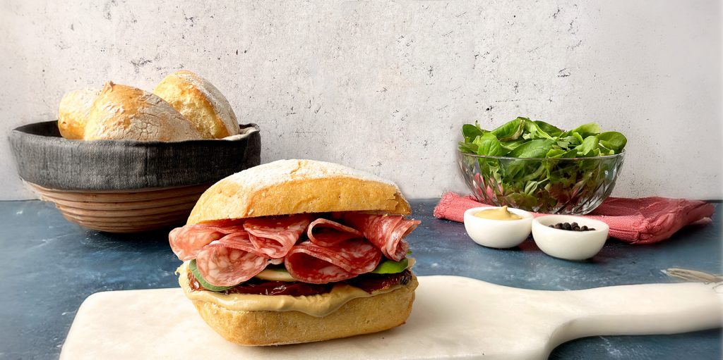
Panino with Napoli salami, artichokes, and mozzarella: a boldly flavourful choice for those who love layers. Ingredients: michetta bread; slices of Negroni Napoli salami; Artichokes in oil to taste; 1 mozzarella; black olive pâté to taste; rocket to taste.
Panino with Negronetto, smoked scamorza, mustard, chicory, and sun-dried tomatoes: a panino for anyone who loves strong flavours. Ingredients: 8 slices of Negronetto; 1 durum wheat roll; 3 sun-dried tomatoes; 1 tablespoon of mustard; 3 slices of smoked scamorza; a few fresh chicory leaves.
CREDITS
Agency: Armando Testa
Creative Team AT Design: Patrizia Massarenti, Lara Aldrighi, Dario Trigiani, Federica Lamonarca
A symbol that has become an icon: this is the story of Maserati’s legendary Trident, which is celebrating its centennial with a global campaign created by the agency 777, founded with the merger of Armando Testa and Herezie.
It was back in 1926 that the Trident first appeared on a Maserati car. Designed by Mario Maserati, who was an artist in the family, and inspired by the statue of Neptune in Bologna: an emblem of strength, courage, and determination destined to become the brand’s unmistakable logo.
To mark this important anniversary, 777 has developed a global digital campaign that includes OOH and DOOH billboards, where the word “Ride” emerges from within the word “Trident,” as if suggesting a journey rooted in the brand’s very origins.
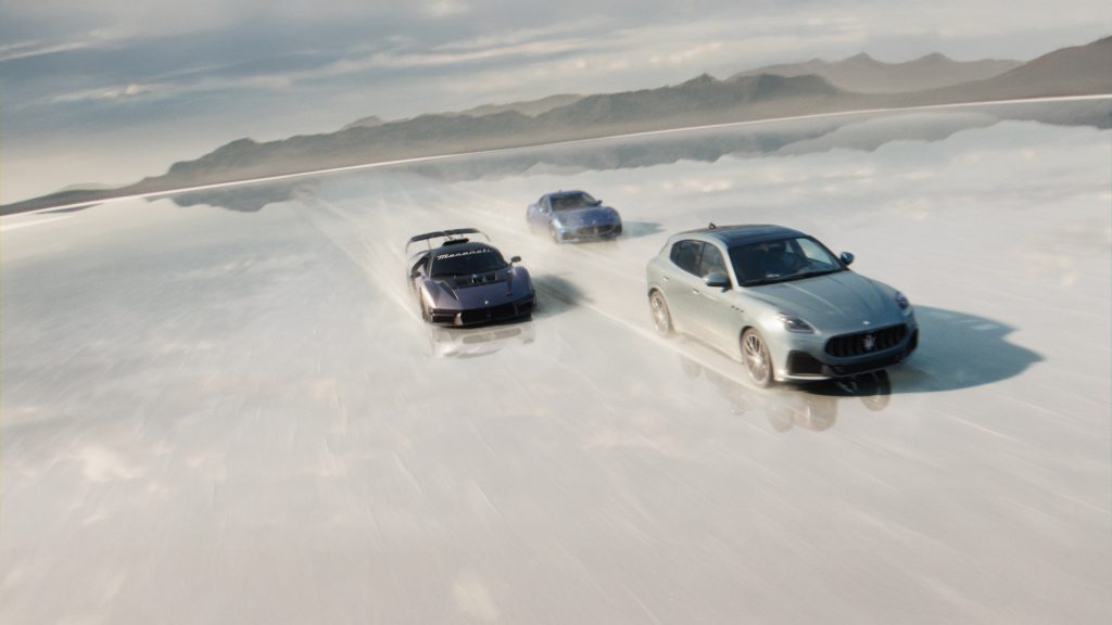
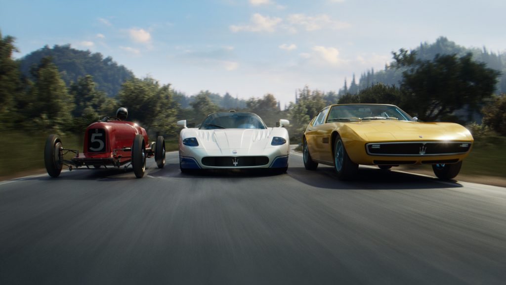
The celebration culminates in a hero video. Visual storytelling that spans time, letting historic cars and contemporary models engage in dialogue, and which comes to life from a key question: when does an emblem become a legend?
The video interprets the brand’s soul and entrusts it to a voice that is an echo from the past: the voice of Maria Teresa de Filippis, the first woman to qualify for a Formula 1 Grand Prix and actually behind the wheel of a Maserati. A tribute to those who, together with the brand, have shared that same authentic and pioneering spirit that defines its essence.
Masterati has embodied passion and performance for a century, the excellence of Italian design and the ability to innovate in an exciting way.
Today, we are celebrating a journey that looks to the future with the same passion as when it all began: under the banner of the Trident.
CREDITS
Advertising Agency: 777
Executive Creative Director: Andrea Stillacci
Creative Team: Mattia Grassi, Giulia Di Crescenzo, Federico Albanese
Editor: Thomas Marino
Client Director: Marco Evola
Account Team: Diletta Marchi
Directors: Bruno Detante, Benini Stephane
Production & Post-Production Company: MATHEMATIC
CEO: Guillaume Marien
Executive Creative Producer: Augustin Vernier
VFX Producer: Gouna Logan
VFX Coordinators: Chiara La Selva
CG & VFX Supervisor: Jehan Bouazza, Yann Aldabe
3D Environment: Yann Glica, Alan Bauge, Valentine Fripier, Lorine Guyard
3D Modeling & LookDev car: David Labelle, Nathan Vidal, Vincent Flohic
Previz & Layout: Julien Gohard, Pierre Outin
Animators: Cyril Cassaigne, Julien Gohard
Rig: Guillaume Boudeville
Lighting & Renders: Dorian Douaud, François Heysen
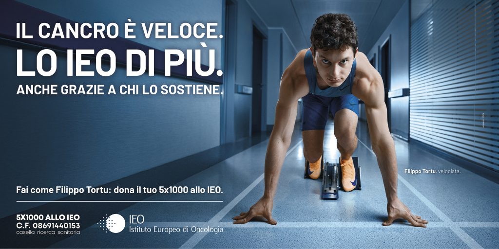
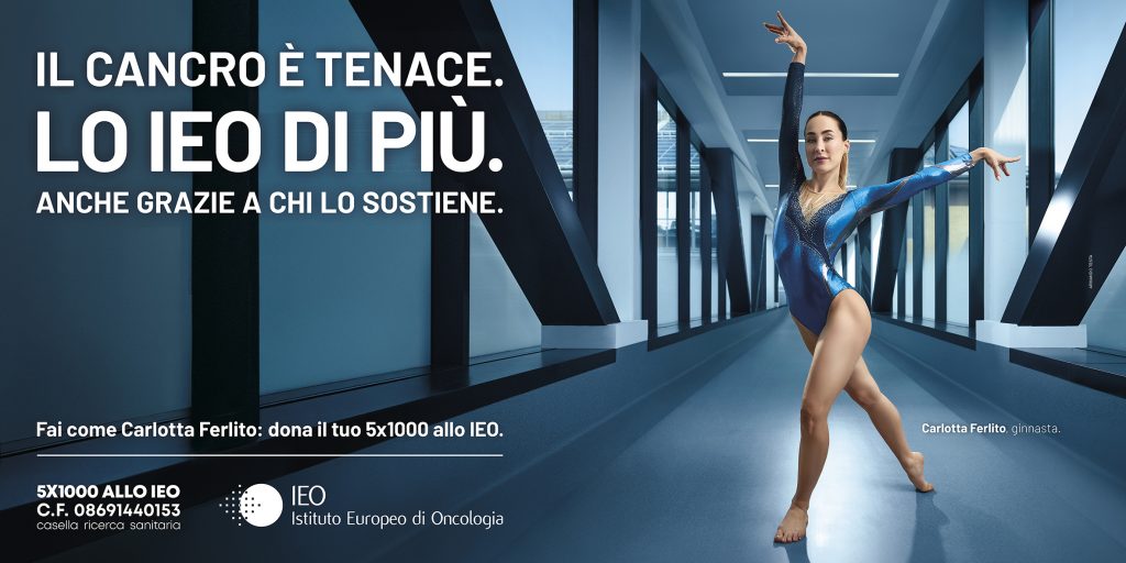
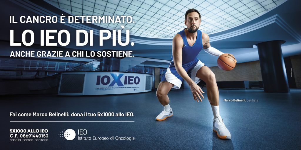
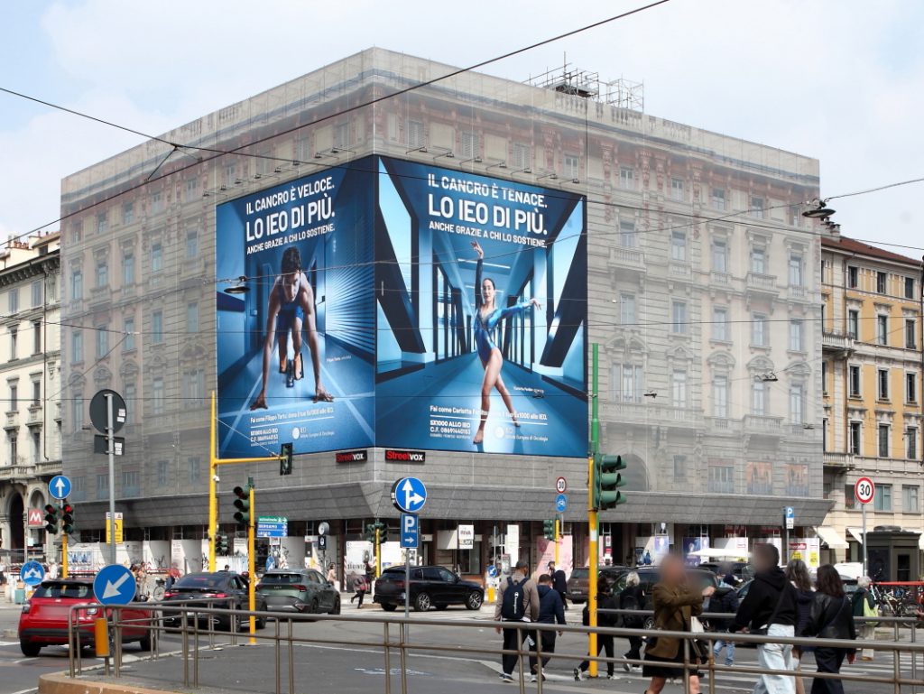
IEO e Armando Testa tornano in comunicazione con la nuova campagna dedicata alla raccolta del 5×1000.
Dopo il progetto dello scorso anno, che vedeva protagonisti i medici dell’Istituto Europeo di Oncologia affiancati dalle ombre di animali forti e fieri, la comunicazione evolve e sceglie quest’anno di puntare su grandi atleti italiani.
In un anno in cui Milano è al centro dell’attenzione internazionale grazie alle Olimpiadi e Paralimpiadi, la nuova campagna sottolinea il legame profondo tra i valori dello sport e quelli dell’Istituto Europeo di Oncologia: determinazione, forza, resilienza, disciplina.
La ginnasta Carlotta Ferlito, la pallavolista Francesca Piccinini, la pugile Giordana Sorrentino, il cestista Marco Belinelli e il velocista Filippo Tortu hanno prestato il proprio volto alla campagna, interpretando la loro disciplina all’interno degli spazi dello IEO e dando vita a un racconto intenso ed emozionante.
Un racconto che rende ancora più chiaro il valore del contributo di chi sceglie di sostenere l’Istituto.
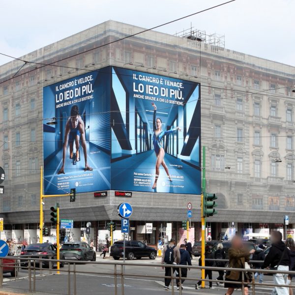
“Il cancro è forte, veloce, tenace, determinato. Lo IEO di più. Anche grazie a chi lo sostiene.”
È questo il claim della campagna ideata dall’agenzia Armando Testa.
La pianificazione prevede affissioni, anche nei maxi formati, nei punti strategici della città di Milano, tram, pensiline, attivazioni sul territorio e contenuti social che coinvolgono anche gli atleti protagonisti.
La campagna sarà on air per tutti i mesi dedicati alla raccolta del 5×1000.
La casa di produzione è AT Studios. La pianificazione vivrà anche a cura di Media Italia.
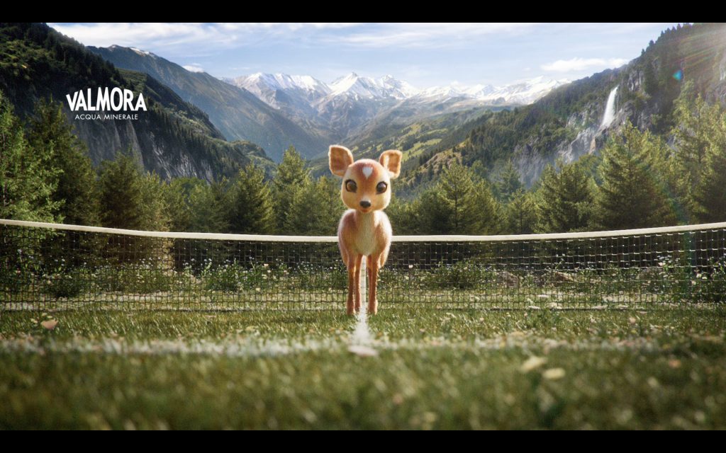
The brand narrative of Acqua Valmora is evolving and thanks to the new version of the corporate ad created by Armando Testa the connection with the world of tennis is growing even stronger. The goal is to consolidate the brand’s positioning as official partner of the Italian Tennis and Padel Federation and as the “Water of Italian Tennis”, while still focusing on the distinctive values of its Alpine origins, naturalness and purity.
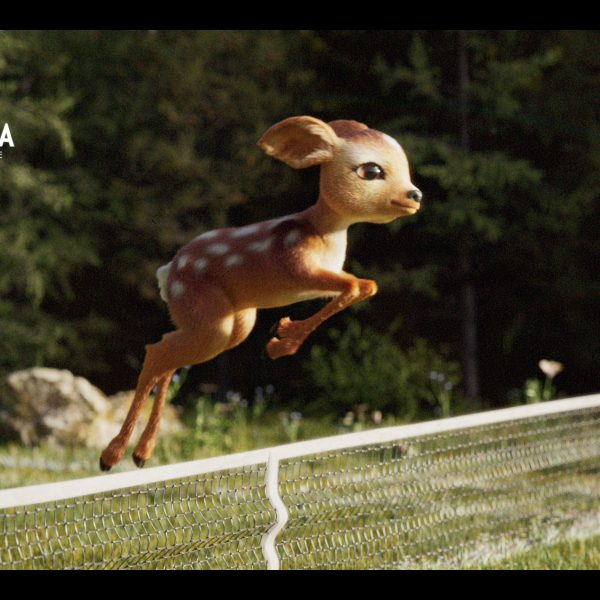
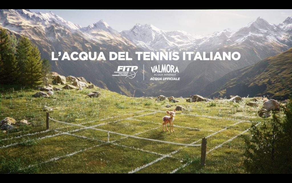
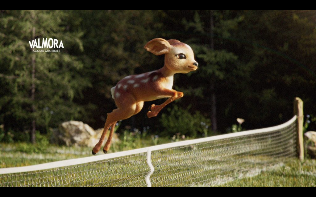
The little fawn is once again the star of the new subject. Wandering through the Rorà Mountain Park – in the heart of the Piedmont Alps – all of a sudden he finds himself in a tennis court, nestled among the mountains, as if attracted by the call of the passion for sport which the brand embodies.
The tennis court, immersed in nature, perfectly represents the encounter of the two souls of Acqua Valmora: on the one hand uncontaminated nature, a place where water flows pure, and on the other the world of tennis which the brand has consistently dominated.
The campaign claim “La fonte della tua natura” (The source of your nature) is complemented in this new subject by a voice announcing “L’Acqua del Tennis Italiano” (The Water of Italian Tennis), which reinforces Valmora’s positioning as the official water of this sport.
The ad is running on TV, with extensions on social and digital channels, along with press planning and visibility initiatives on the occasion of major international tennis events such as the Rolex Monte-Carlo Masters, the Internazionali BNL d’Italia in Rome, the Davis Cup and the Nitto ATP Finals in Turin where Acqua Valmora is a partner.
The ad was produced by AT Studios, with CGI and directing support from H7-25.
Planning managed by Personal Media.
CREDITS
Client: Acqua Valmora
Agency: Armando Testa
Creative direction: Jacopo Morini and Fabiano Pagliara
Durability, practicality, ergonomics: Cuki’s aluminum extra-strong trays always take their place on the winners’ podium for quality. And now Cuki is back on TV with their “Food Game” to tell us all about it. This new communication campaign was created by the Armando Testa agency, it describes how excellent their products are in a simple, fun and engaging way.
This stands as confirmation that the Testa style has a distinct visual signature that upholds continuity and remains contemporary even as it evolves. The tone of the new campaign remains faithful to the previous iconic campaign “Food Attack”: the theme of a paradox was a success in becoming an original and amusing multi-subject campaign, able to touch people’s hearts with its simplicity and light-heartedness.
With today’s new 10’ reboot’, food takes centre stage, but in an even more playful way – literally this time. Cuki’s aluminium trays turn into two loveable tennis rackets which challenge each other to a match with side dish shots. Durability is always the winner. Game, set, Cuki.
The campaign kicks off on 30th March, airing primarily on digital TV channels, strategic planning also includes Amazon channels. The campaign also features a complete social media toolkit, with specially created static and dynamic assets to reach targeted strategic objectives.
Produced by AT Studios. Media planning managed by Media Italia.
CREDITS
Client: Cuki Cofresco
Marketing Manager: Carlo Bertolino
Brand Manager: Elisabeth Beccaris
Agency: Armando Testa
Creative direction: Jacopo Morini and Fabiano Pagliara
Creative team: Gabriella De Stefano, Dario D’Angelo
From 23rd March and for two weeks, the Theodora Foundation is bringing its message into the streets of Milan and Turin with a large-scale outdoor campaign conceived to raise awareness of the mission of the Foundation among the general public: allow kids in hospital to keep on dreaming.
Planning includes extensive coverage from city centres to the outskirts of the two cities, featuring a mix of maxi ledwalls, maxi digital displays, digital installations and static posters, transforming the urban space into a platform for storytelling and building awareness about kids in hospital.
The creativity is the same as the ad developed by the Armando Testa agency and launched in 2025 on the occasion of the 30th anniversary of the Theodora Foundation in Italy. That campaign was very sensitive in conveying the value of the work carried out every day in kids’ wards.
The poster features the encounter between a young patient in hospital and a Dream Doctor. It is related through a visual narrative that combines reality and imagination. The kid’s drawings are included side by side with the real scene, and the visit of Dream Doctor, as she takes a fox puppet to play with the child, transforming the hospital room into a small fantasy world.
The illustrated fox seems to come to life around the child’s bed, so it becomes a symbol of the Dream Doctors’ imagination and ability to transform a difficult moment into a fun experience of playing, connection, and comfort.
The visual is accompanied by the message “Their dreams, our mission,” summing up the core of the Foundation’s work: ensuring that every child can continue to cultivate their dreams, even while they are in hospital.
Founded in 1993 in Switzerland by brothers André and Jan Poulie, the Foundation arrived in Italy in 1995 at the National Cancer Institute in Milan. It is named after their mother, Théodora Poulie, a generous and courageous woman who bravely faced life’s challenges, including her son André’s illness. From this experience, the idea of transforming smiles and dreams into a concrete form of treatment took hold.
The Dream Doctors are at the heart of the Foundation’s work. They are specially trained professionals who work in pediatric wards, providing personalised support for hospitalised children and young adults. Using games, listening, and interacting, they contribute to the psychological well-being of their young patients, also helping their families and healthcare professionals.
Today, the Theodora Foundation is active in 44 pediatric wards of 13 hospitals in 10 Italian cities. In 2025 alone, thanks to 31 Dream Doctors, more than 40,000 children and adolescents were seen, and support was provided to more than 120,000 family members. Internationally, the Foundation operates in six countries, with over 200 Dream Doctors working in more than 160 healthcare facilities.
The communication campaign for the Foundation’s 30th anniversary was conceived by the Armando Testa agency, with executive creative direction by Michele Mariani, client management by Benedetta Buzzoni, the creative team consisted of Matteo Giachin Ricca, Caterina Maliardi, and Ilaria Lavagnolo, it was directed by Luca Grafner, with animation by Studio Magoga, and musical production by Operà Music. The campaign was created pro bono in collaboration with the production company AT Studios.
With their renewed presence in cities, the Theodora Foundation is updating its invitation to the public: supporting the Foundation means helping more and more hospitalized children continue to dream.
This educational project is promoted by the multi-utility company in collaboration with the iconic Modena-based company. It will visit a number of primary schools in Bologna and Modena to raise awareness among children and families about sorting out waste. Friendly characters, created by the Armando Testa communications agency, will be alongside the youngsters as they embark upon their sustainability adventure.
“Got it, that one’s missing”. This time the collectable cards do not feature sports stars or comic book heroes, but rather Scartolina and Plastibolla. They’re the ones, the rejects, the waste, who are the heroes of “A dream called recycling”, the album of stickers created by the Hera group, one of the Italy’s main multi-utility companies, in collaboration with Panini, the famous Modena-based company which specialises in collectable sticker products as well as the Armando Testa advertising agency.
The educational project is promoted by Hera and was conceived to guide kids and youngsters in exploring waste recycling using an engaging tool that activates their imagination. It’s starting off in the coming days in some primary schools in Bologna and Modena.
Using stickers and games, the album tells a story with a happy ending where the waste products have a “dream in the trash” to fulfill: to become something precious. As the fantastical story unfolds the kids are accompanied on a journey that starts with the production of waste and ends up with it becoming something valuable in the recycling plants, highlighting the services Hera offers the community and the daily tasks undertaken by the refuse collectors.
How the initiative involving primary schools works
The pilot project involves nearly two thousand students between March and May 2026, in line with timetables agreed with teachers. In Bologna, the Padre Marella and Viscardi primary schools have already joined the initiative; in Modena, the Montecuccoli, Leopardi, and Don Milani schools are ready to start. The initiative involves four meetings for each class, during which the children will receive the albums and stickers and will be able to engage with environmental educators from the Great Machine of the World (the Hera Group’s historic educational project for schools), taking a deep dive into issues such as sustainability, the circular economy, resource protection, and sorting of waste products. While the project is running, additional free packets of stickers will also be available when waste is disposed of at all recycling stations in Bologna and at the Leonardo collection depot in Modena. This initiative also aims to actively involve families, encouraging virtuous behaviour and building greater awareness of environmental services. A special prize will be awarded by the Hera appointed educators for the first completed album.
Themes and characters: Plastibolla and Scartolina’s dream comes true at Hera plants send comments
The album, created by Hera in collaboration with Panini, is an original educational tool that allows for a simple and fun exploration of topics such as waste recycling, the circular economy, learning how environmental services work in the community, and the contribution we can all make through our own behaviour. That’s where the friendly characters created by the Armando Testa agency come into play: each one personifies a category of waste with a desire: to come to life again. In addition to Plastibolla, made of plastic packaging, and Scartolina, a character made of paper and cardboard, there are Metallaro, Vetrinozzo TinTin, Nucciabuccia, CamyRami, Mister Miscuglio, Oliastro Esausto, Max Ingombro, and Tekno. Ten colourful, fun-loving friends – with their games and curiosities, they take the kids along to the facilities where dreams come true. Every piece of waste disposed of in the right place will contribute to a better world. Some will be reborn as energy, some will return to being paper or plastic, some will become biofuel, and some will be repurposed to be useful again. All for the good of the planet.
“By creating this album, in collaboration with two companies of the caliber of Panini and Armando Testa, we want to tell a true story where citizens, especially children and their families, play a vital role alongside us in pursuing the circular economy and the sustainable development goals as outlined by the UN 2030 Agenda,” explains Giulio Renato, Central Director of Environmental Services and Fleets at the Hera Group.“We are certain that engaging younger generations on these issues is essential, and that’s why we’ve long been involved with all levels of schools with our projects, The Great Machine of the World and Well of Science. More than one hundred thousand students take part every year.”
“For more than sixty years the Panini sticker albums have inspired the imagination and games for generations of kids. With this project we wanted to take advantage of this language to convey an important message like environmental sustainability – comments Martina Limoni, Panini Collectables Director –. “Transforming waste into characters you want to collect is a simple and engaging way to showcase the value of recycling and help children understand how everyday behaviour can make a difference for the future of the planet”.