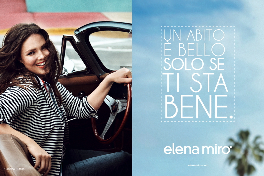
CANDICE HUFFINE STARS IN THE ELENA MIRÒ MESSAGE CREATED BY ARMANDO TESTA

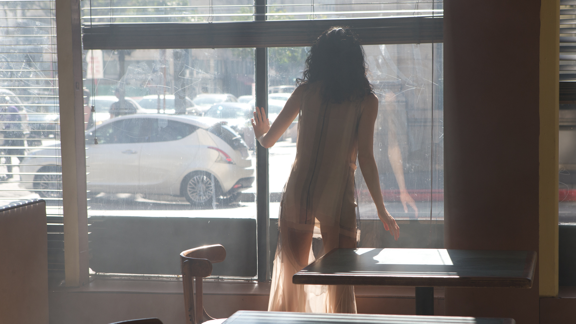
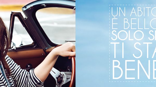
“UN ABITO È BELLO SOLO SE TI STA BENE” (AN OUTIFT IS BEAUTIFUL ONLY IF IT SUITS YOU): this is the claim of the new communication project for the Elena Mirò Spring/Summer 2015, collection, which stars Candice Huffine, the famous, curvy American top model, and one of the most prominent faces in the recent Pirelli 2015 Calendar.

She was entrusted with the task of conveying a message which completely overturns the classic perspective of fashion and which best represents the philosophy of the brand, aiming right at the heart of all curvy women who love to dress with style and good taste. The time has come to highlight the true role played by fashion.

“UN ABITO È BELLO SOLO SE TI STA BENE” (AN OUTIFT IS BEAUTIFUL ONLY IF IT SUITS YOU) at last gives voice to the thoughts of those women who are tired of falling for beautiful clothes only to find that once tried on, they disappoint and lose their appeal because they do nothing for you.

A manifesto in favour of fashion that brings together style and wearabilty, with the certainty that inventing an outfit which follows trends is not enough: what’s vital is enhancing what’s unique about every woman.

Remaining true to this philosophy, Elena Mirò and the Armando Testa agency have created the new advertising communication project which sends out a message which is new, fresh and innovative for the world of fashion. The launch is planned for the month of March in main fashion titles and using a series of videos for web channels.

The Elena Mirò photos were shot on location in Miami by Signe Vilstrup. For Armando Testa art director Barbara Ghiotti and copywriter Pierfabio Iannuzzi, with executive creative direction from Michele Mariani.

Posted in Uncategorized

LINES FOR PINK IS GOOD – SUBJECT. “MINUTES FROM”

Lines has always been attentive to the needs of women and today they are making a direct commitment for the wellbeing of women by financing research into breast cancer.

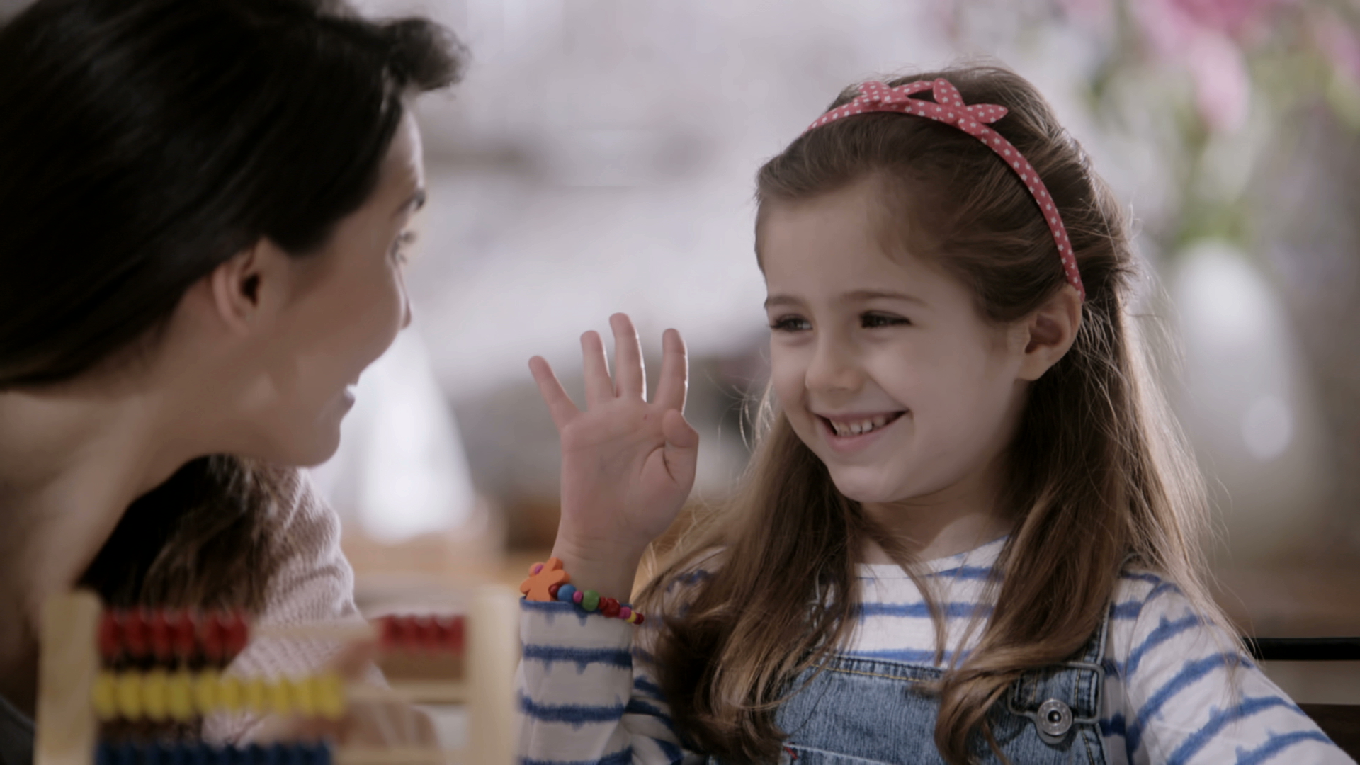
To the notes of a fresh, feminine tune, the protagonists use their fingers to show some numbers: one mum is teaching her daughter to count, a volleyball player gives the conventional two finger signal to her team mates, two old friends raise their thumbs to hitch hike. The situations are stolen moments from everyday life, but they also represent the minutes that every woman can donate to research. Because “every extra minute helps the Veronesi foundation in their research on breast cancer”.

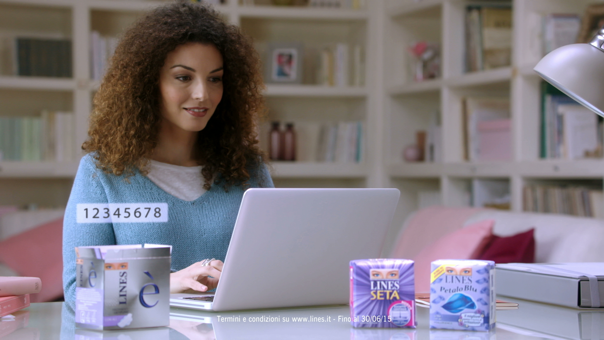
Lines supports the project “Pink is Good” by donating a minute of research for every pack purchased. Inserting the code inside the pack in the Lines site is all it takes.

The film ends with a scene of collective empathy which features all the protagonists together in a friendly group hug along with the claim: “Pink is Good. Your minutes help beat it”.

With creative direction from Piero Reinerio, Monica Barbalonga, art director and copywriter Chiara Demichelis worked on the project. Directors: Luca and Marcello Lucini. Production Company: Little Bull. Planning by Media Italia.

Posted in Uncategorized

A SURPRISE PARTY CREATED BY ARMANDO TESTA TO CELEBRATE LANCIA YPSILON’S 30TH BIRTHDAY

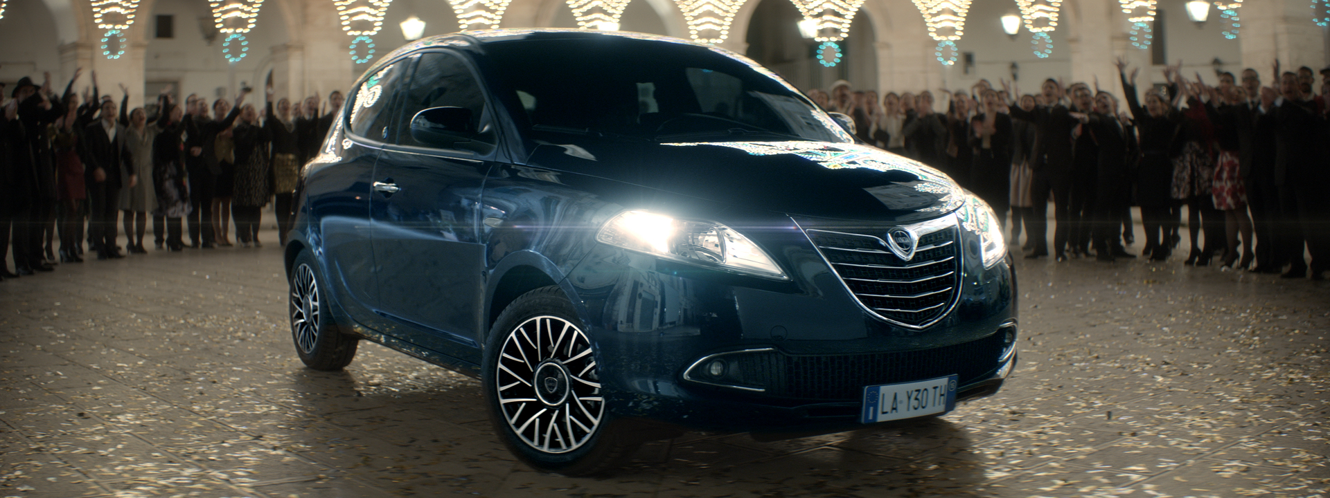
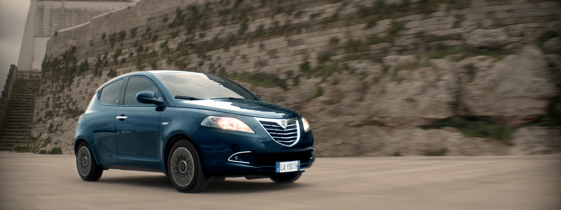
Lancia Ypsilon is celebrating its thirtieth birthday with a new communication which manages to convey all the values the Ypsilon brand has embodied since its birth and which for thirty long years have made more than two million Italians fall in love: style, elegance, ability to interpret traditions in a modern way.

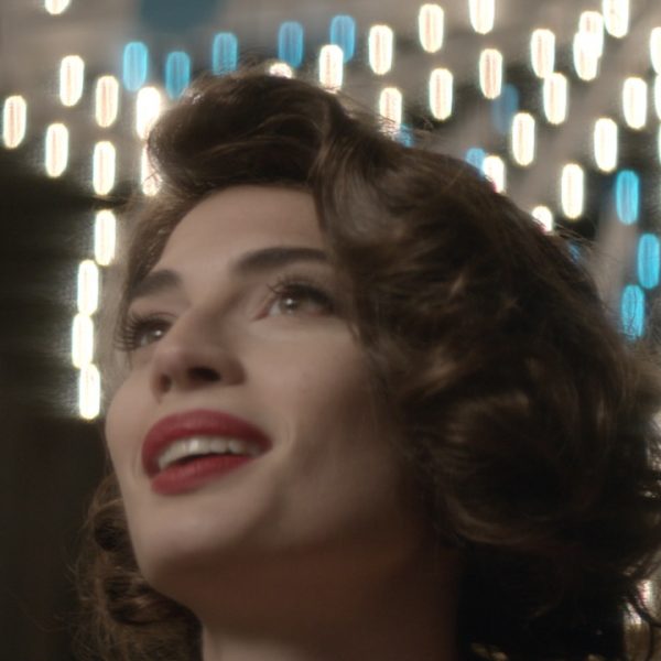
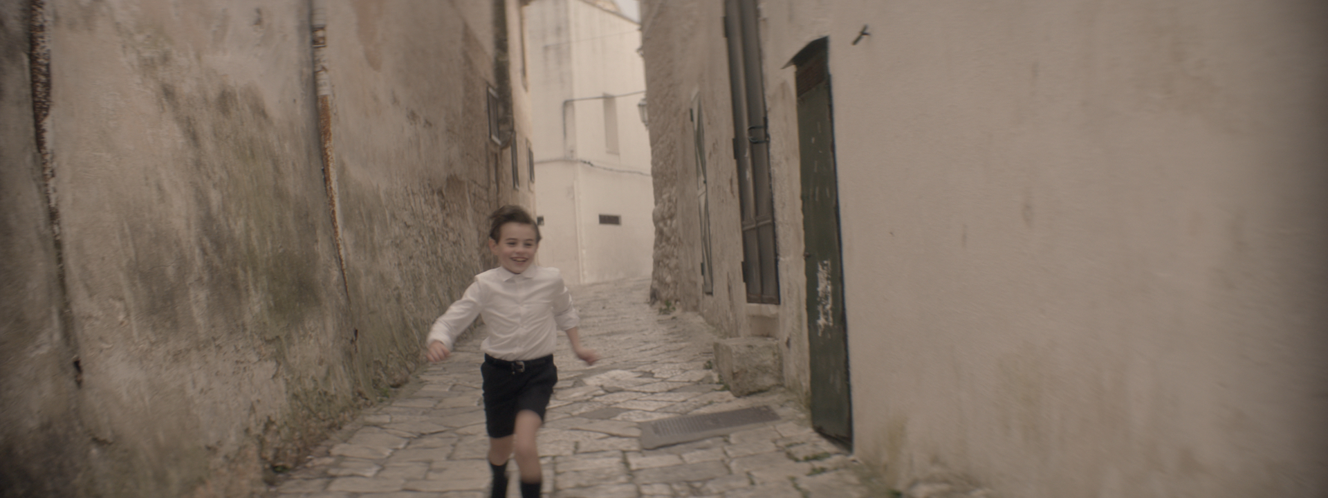
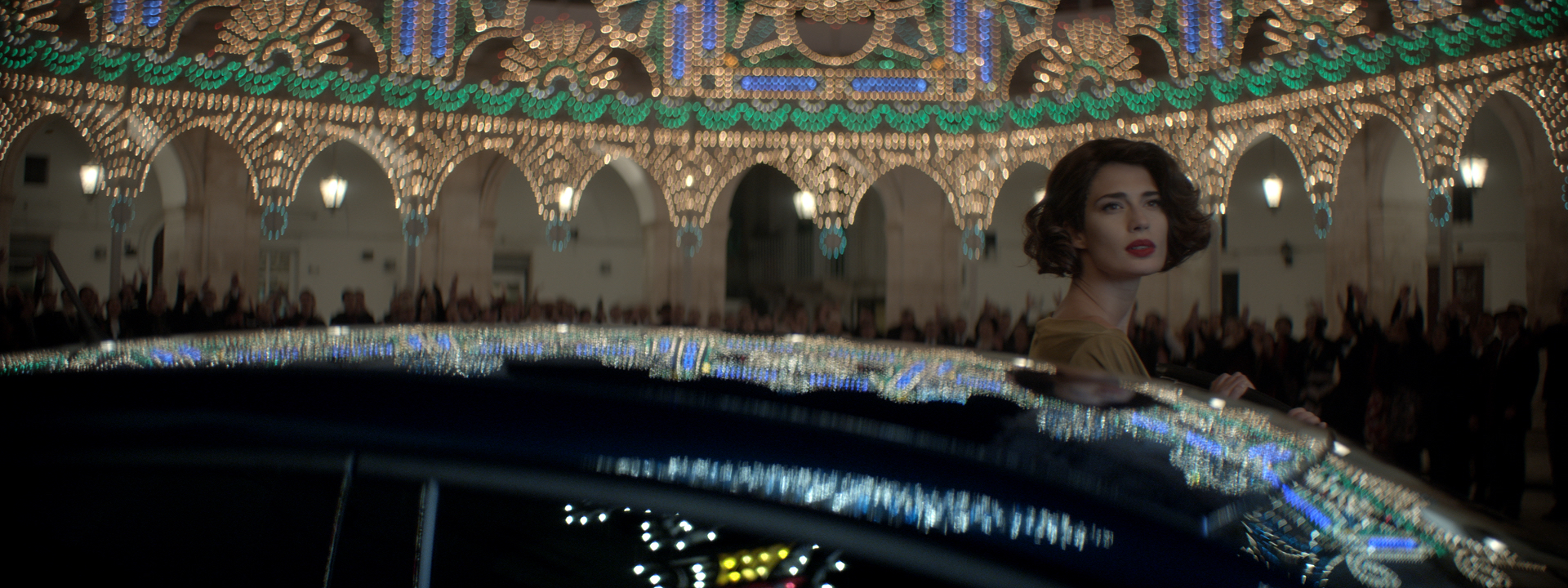
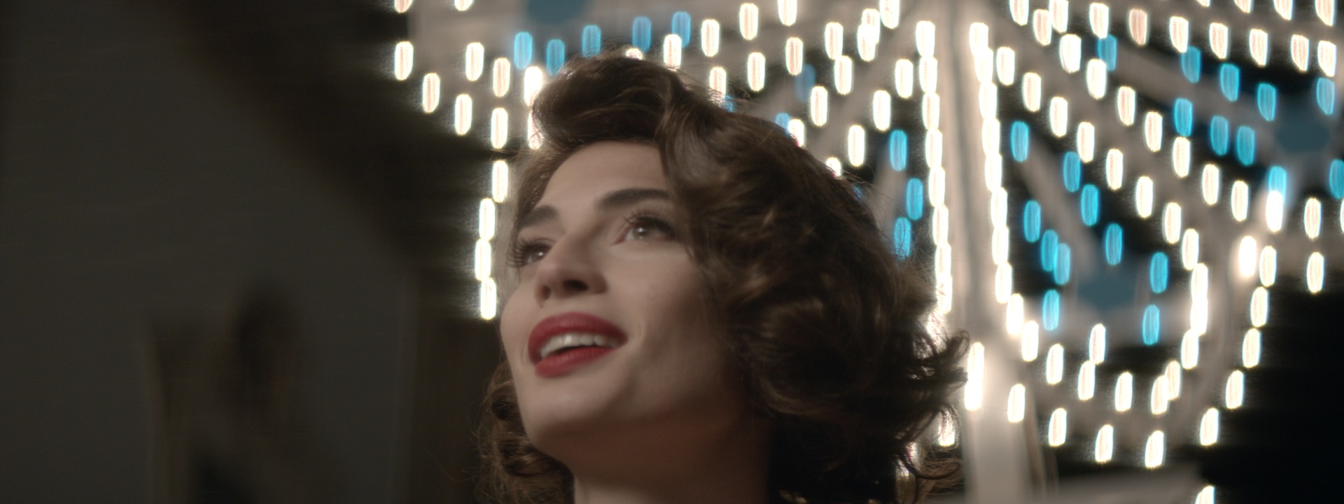
In a small town in the South of Italy a friendly, lively kid catches a glimpse of the lines of a Lancia Ypsilon on the horizon as it travels gracefully along the curves of the countryside. This vision triggers the kid to start running along the streets of the town to warn the inhabitants that someone special is on their way. In the meanwhile, the Ypsilon, which is being driven by a beautiful young woman, arrives in town. But the streets are deserted, the shops are all empty and there’s not a living soul to be seen. It looks like a ghost town. Where has everybody got to? Shortly after we’ll discover that the inhabitants have prepared a fantastic surprise party: they’ll all come out of hiding to wish Lancia Ypsilon and the woman an amazing Happy Birthday: “Happy birthday to Ypsilon. Happy birthday to you.”

The creativity underlines the link that there has always been between Ypsilon and traditions, but also its ability to always convey them in a novel way, in step with the times: the atmosphere and the typical traditions evoked by a small town in the south of Italy are revisited in a modern, more fashionable style and the characters are all well developed for both image and styling. To celebrate along with Lancia Ypsilon and the 2 million Italians who’ve always loved it, thirty years embodying style and elegance.

The ad was created by the Armando Testa agency with creative direction from Raffaele Balducci.

Directed by Ago Panini with production company Akita Film.

The campaign has been planned in the press, on radio, TV and web.

Posted in Uncategorized

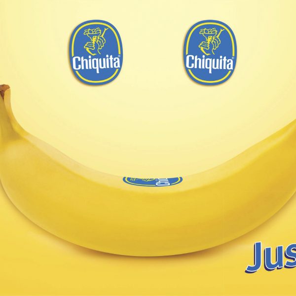
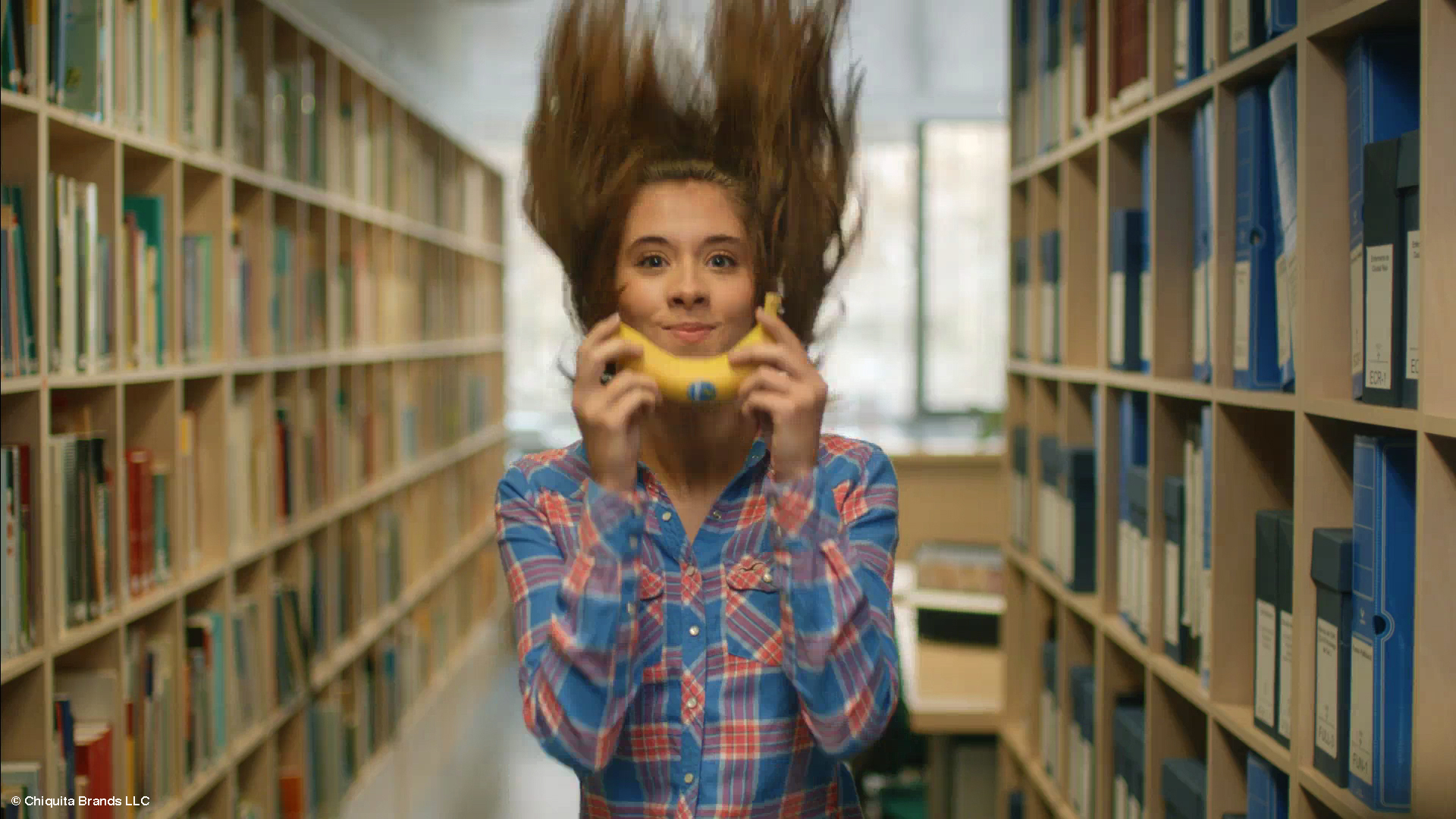
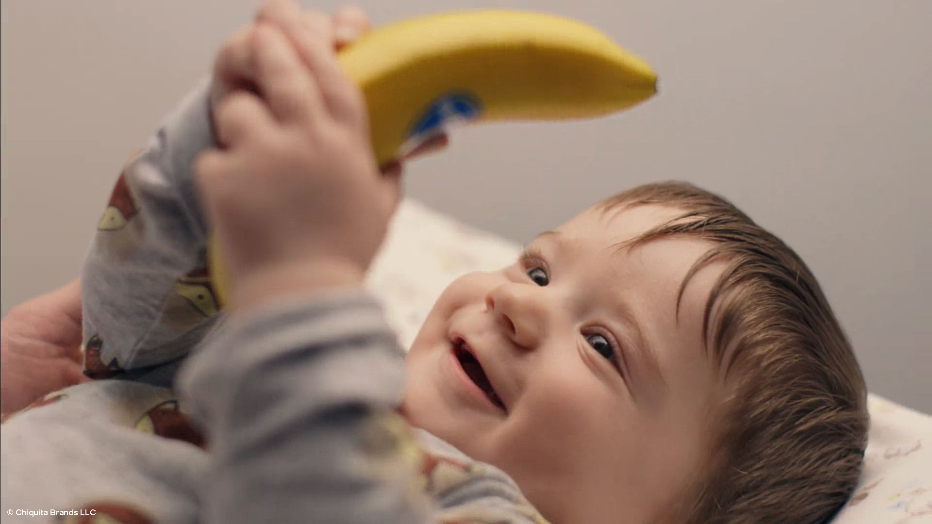
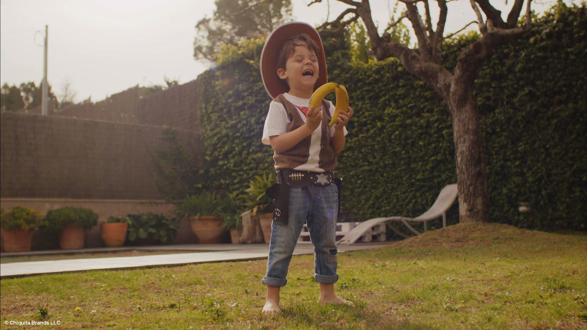
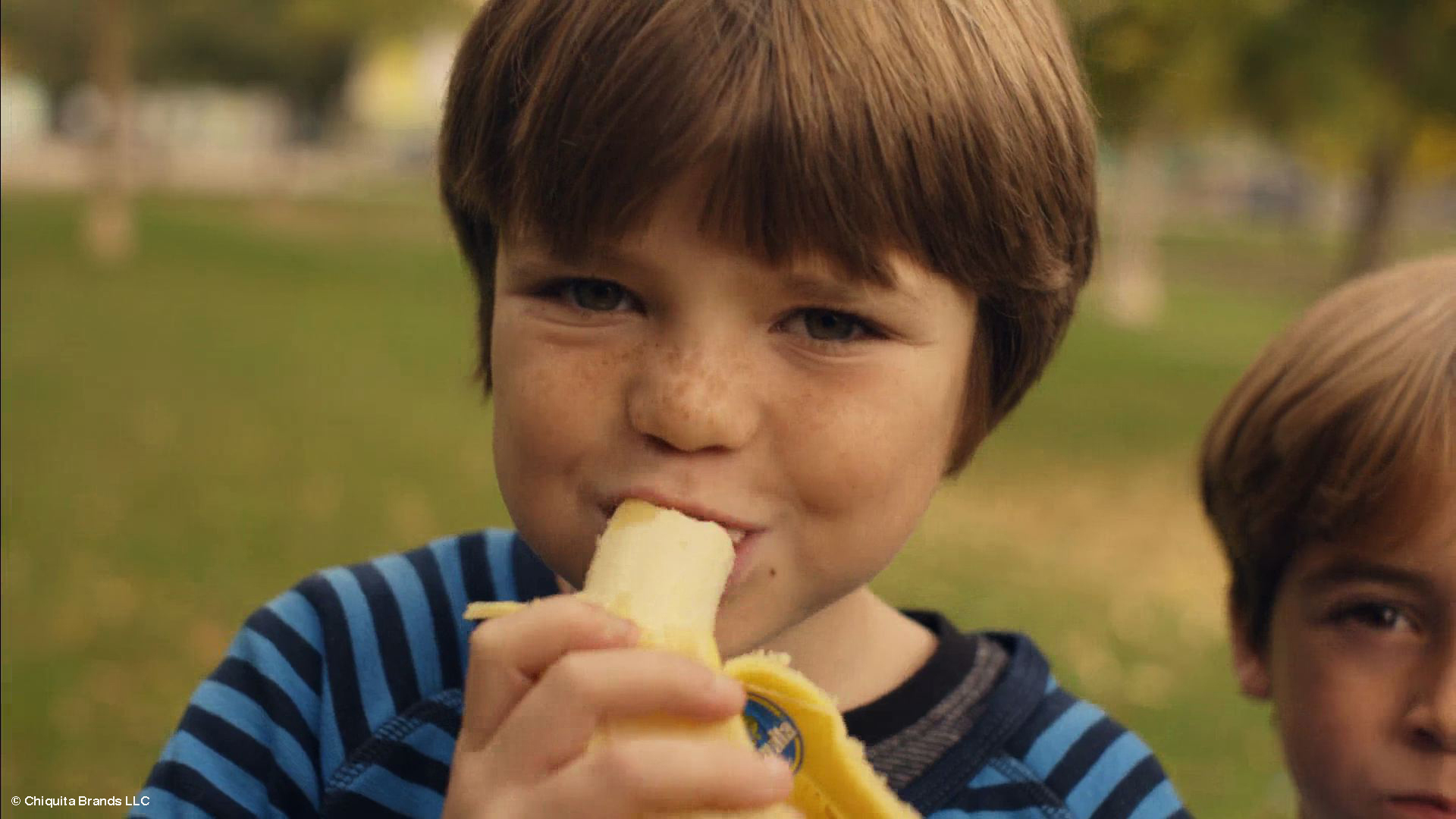
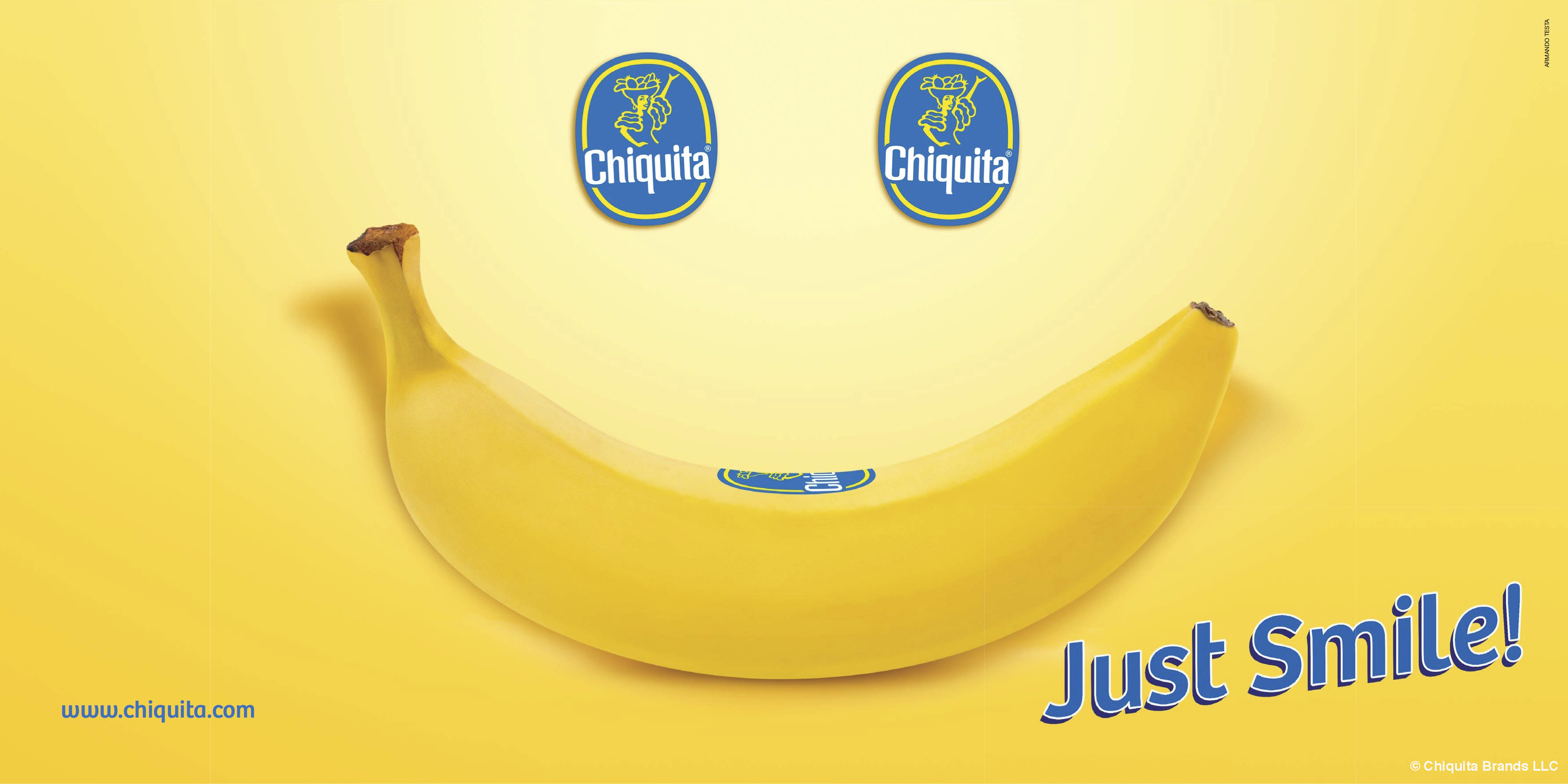
“JUST SMILE!”: CHIQUITA AND ARMANDO TESTA INVITE YOU TO SMILE.

The campaign focuses on the playful and positive character of the iconic banana brand and issues an invitation to face life with a smile because smiling is natural, just like a Chiquita!

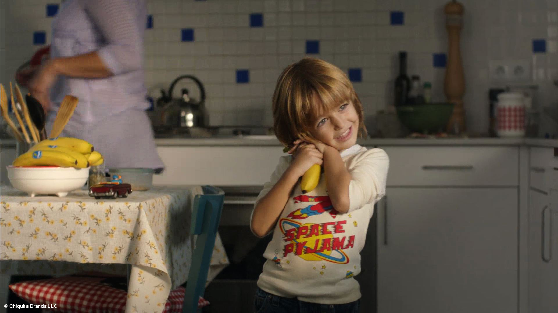
At the core is a contemporary TV spot developed by leading advertising agency Armando Testa, which has been managing the brand’s communication in Italy and Europe for a number of years.

Michele Mariani, Armando Testa executive creative director, explained the vision behind the campaign:

“Just Smile! features a series of light-hearted video vignettes showing the global community interacting with Chiquita. All the ingredients are there: the iconic bright yellow banana, the friendly Miss Chiquita, the fun blue sticker, the involving Chiquita Song, all brought together to represent a universe of positive, smiling people, even if only for a second, because nothing is more contagious than a smile.”

Jim Hill, European Marketing Manager for Chiquita, further added:

“The Just Smile TV campaign was built off research led by our Global Consumer Insights Manager, Stefano Perilli, and rooted in our fun and playful positioning, building on the emotional equity behind the brand.All pre-testing indicates the campaign, backed by a strong media investment from our new owners, will further cement Chiquita’s position as the best loved banana brand”.

“Just Smile!” will hit TV’s starting March and later in September running across 6 markets: Netherlands, Belgium, Finland, Sweden, Germany and Switzerland, and will be further supported by a targeted digital media investment. It will form part of a fully integrated campaign also visible through outdoor and print media, retail channels, web and social media, ensuring everyone gets the chance to smile with Chiquita.

The Armando Testa team was made up of art director Laura Sironi with copy by Federica Saraniti Lana, and executive creative direction from Michele Mariani. Account director Nicola Crivelli. TVC directed by Danxzen, production company Haibun. Jingle by Catilina Sherman.
You can see the different versions of the tvc on YouTube Chiquita Channel

Posted in Uncategorized

INTESTA – A NEW FEATHER IN OUR CAP.

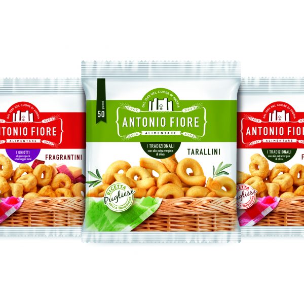
Antonio Fiore Alimentare has been producing Taralli pugliesi crackers since 1955. They entrusted InTesta with the repositioning project, using a new brand image and a new system pack.

The agency of the Armando Testa Group specialises in graphic design and packaging, and they studied the image of the Andria-based company, starting off from the new logo.

Antonio Fiore presents itself today with renewed font and symbol: a quality crest aimed at confirming the value of its products, the natural origin of the ingredients and the brand’s attachment to its local territory. The identity project has also been backed up with complete restyling and rationalisation of the packaging.

The new image is thoroughly revised and aims at using up-to-date visual language to convey the tradition and the quality research inherent in the product. The white background echoes simplicity and transparency; the top view brings to mind the moment of the preparation of the recipe and how genuine the ingredients are. Finally the taralli are the stars of the image and the brand identity. Positioned in a very close-up, they highlight the goodness of the finished product.

The decision to create such a well-defined and communicative graphic line was a direct response to the need to describe the tradition, the simplicity, the variety of flavours and the quality of a product which guarantee its excellence.

The product range, now with a standard design and language is present in mass markets and vending channels. Its mood is decidedly modern, its image is fresh and the new communication style bears the signature of Antonio Fiore.

Posted in Uncategorized

LAVAZZA PARADISE CAMPAIGN – QUALITA’ ORO – SUBJECT ”SUNDAY LUNCH”

It features the couple formed by Enrico Brignano-Tullio Solenghi together again. This time they have to contend with an appointment which is traditional not only in Paradise but also for all Italians: Sunday Lunch.

So we will see that classic moment when everyone comes together to enjoy each other’s company but also to enjoy the pleasure of good food.

Solenghi in his role of Saint Peter is the host and he involves not only the inhabitants of Heaven, but as a surprise all the inhabitants of the Earth too…

Because as Peter wisely says “We like to enjoy Sunday Lunch with everyone!”

Brignano turns up in his Sunday Best to underline just how important this occasion is and how special it is as a family tradition for us, and that’s not all, because he also brings along a coffee which is suitable for such an important event: Qualità Oro Lavazza. Indeed what better occasion could there be to enjoy such a refined blend with a rich taste?

The story closes with another fun twist and why not, it is also instructive about how to interpret (and reverse) roles in heaven.

The ad was created by the Armando Testa agency and like all the Paradise campaign the creative direction is by Mauro Mortaroli, copy by Leonardo Manzini and it was directed by Alessandro D’Alatri, Production company Filmmaster Productions.

It will air on all TV channels and on the web.

Posted in Uncategorized

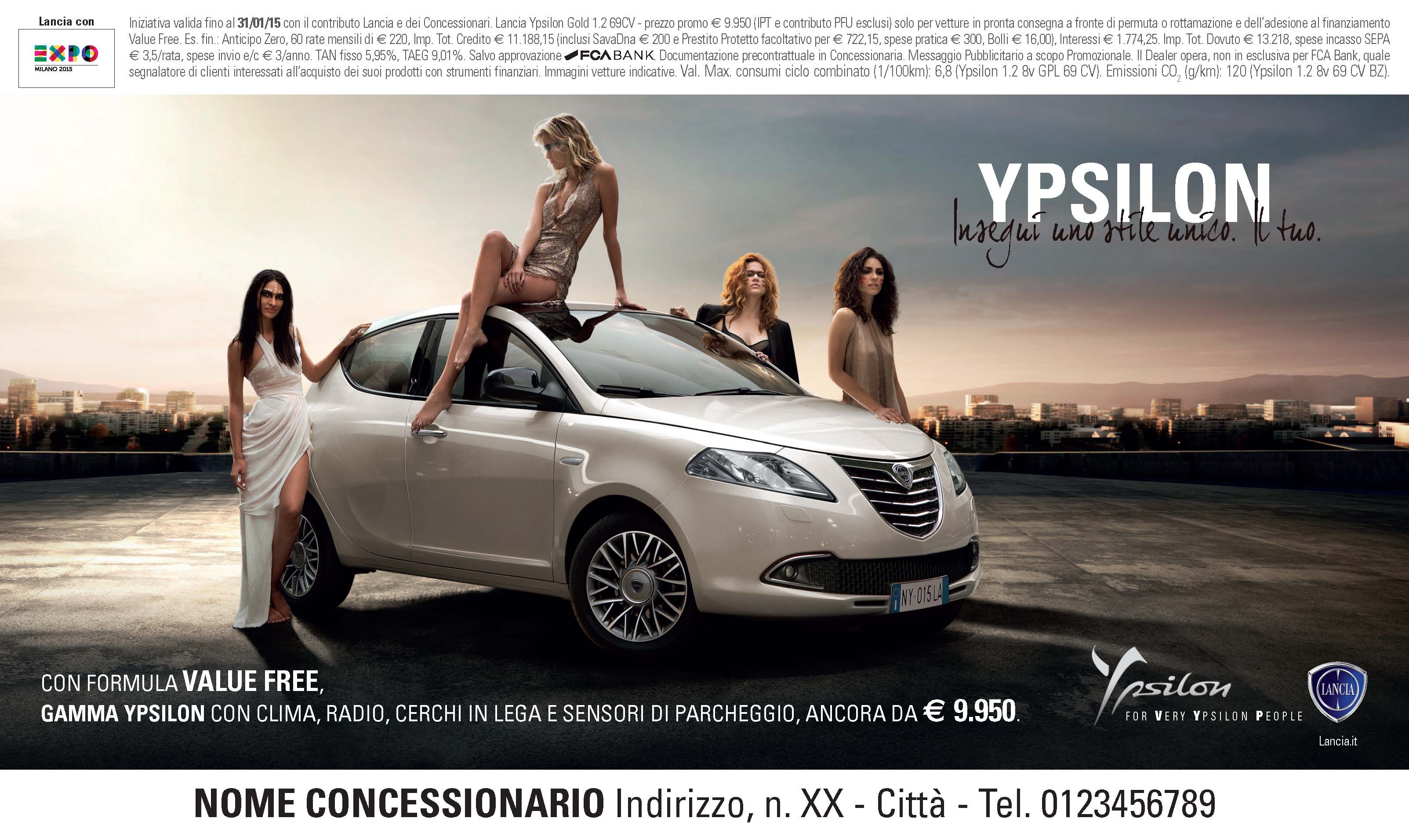
2015 STARTS OFF AGAIN WITH STYLE. LANCIA YPSILON’S UNIQUE STYLE.

A unique personality and a look that stands out. Always.

Lancia Ypsilon does not follow fashions. Rather it gets followed.

Just like in the new film which features an unusual pursuit along the streets of Los Angeles.

An elegantly dressed woman is on the roof of a building. She turns round. Her face shows she is wearing bizarre make-up: lines that bring to mind the camouflage worn by warriors.

There is another woman in front of a mirror; she too is concentrating on painting the lines on her face. As the Ypsilon passes by along the streets Los Angeles, the group of female warriors sets off in pursuit and they race along.

My Love by Kovacs is the sound track of the ad.

The claim “Insegui uno stile unico, il tuo” (Pursue a unique style, your own) highlights once again the main feature of the Lancia Ypsilon and the essence of its exclusive personality which makes whoever chooses it unique.

Creativity by Armando Testa with creative direction from Raffaele Balducci. Production Company Movie Magic International. Shootingin Los Angeles. Directed by Luca Maroni.
Posted in Uncategorized

INTESTA, IDEE IN CALDO. (HOT IDEAS)

Cooperation continues between the inTesta agency, part of the Armando Testa Group and Diva International, the Italian company with headquarters in Umbria, which is leader in the wet wipes sector and a specialist in the development and production of products and innovative solutions for personal hygiene and wellbeing. It is the only European company which produces self-heating bands inside the EU.

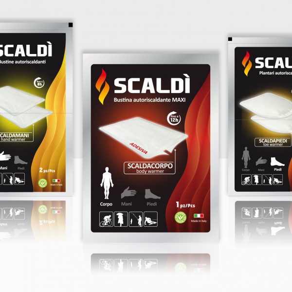
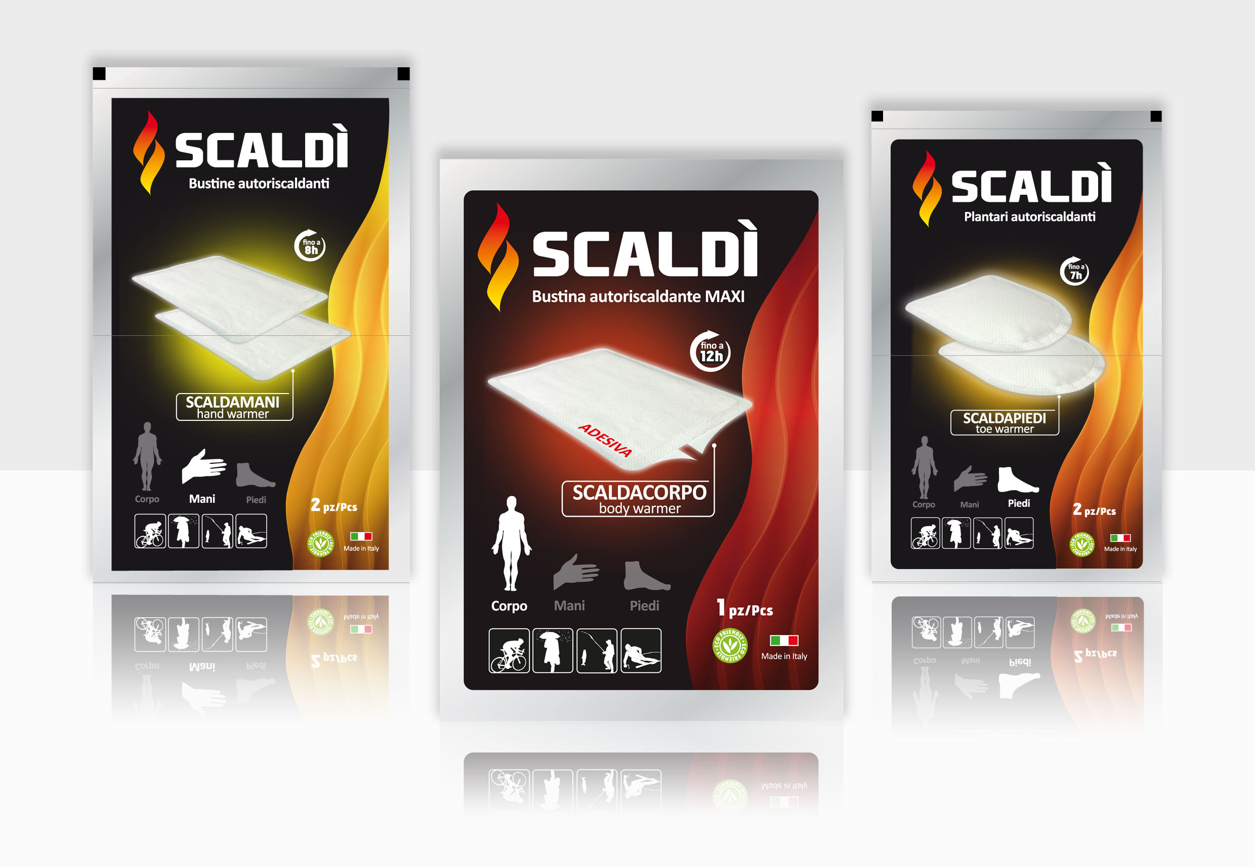
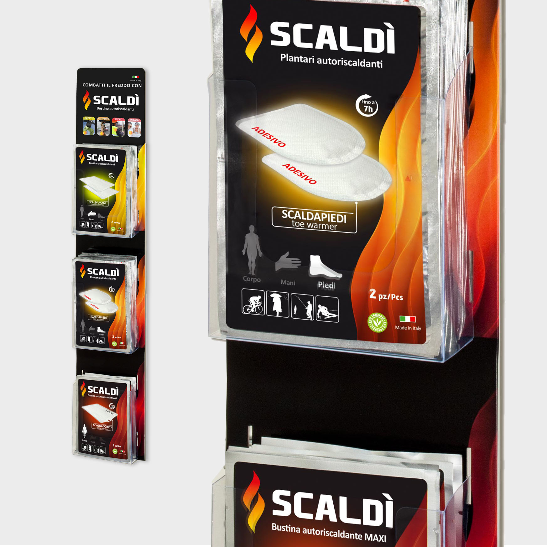
As part of their packaging restyling project, started in 2014, Diva International entrusted inTesta with the development of their new logo, new packaging and all the POS materials for the Scaldì brand, the self-heating bands in individual packs, which are distributed in mass market retail outlets and the main networks of sports goods stores.

The product is entirely produced in Italy and is composed of a mix of substances (safe and non-polluting) – when they come into contact with air a heating reaction is activated.

The idea for the new pack originates from a symbol with stylised waves of modulated colours to represent the heat. The optical effect brings to mind the idea of comforting heat escaping from the pack.

The wave is also featured in the logo, with softened lines and accompanied by an “S” forming the outline of a flame.

The idea of the whole pack, with its choice of warm shades, is to represent the beneficial effect of heat. The same warm strong colours describe the effectiveness of a product dedicated to sport and leisure time.

Posted in Uncategorized

CAVIRO – TAVERNELLO SUBJECT “LA VITE IN CITTÀ“ (Vineyards in the city)

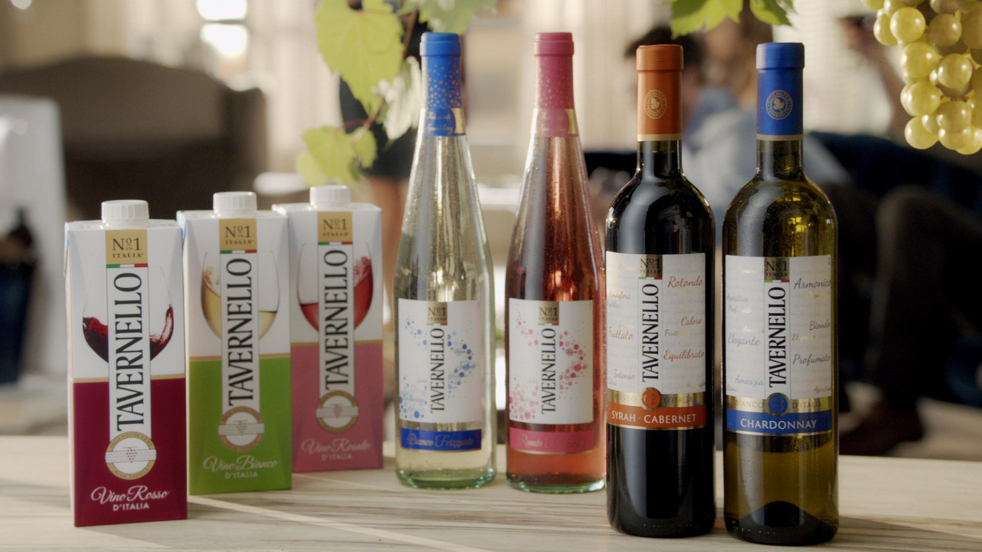
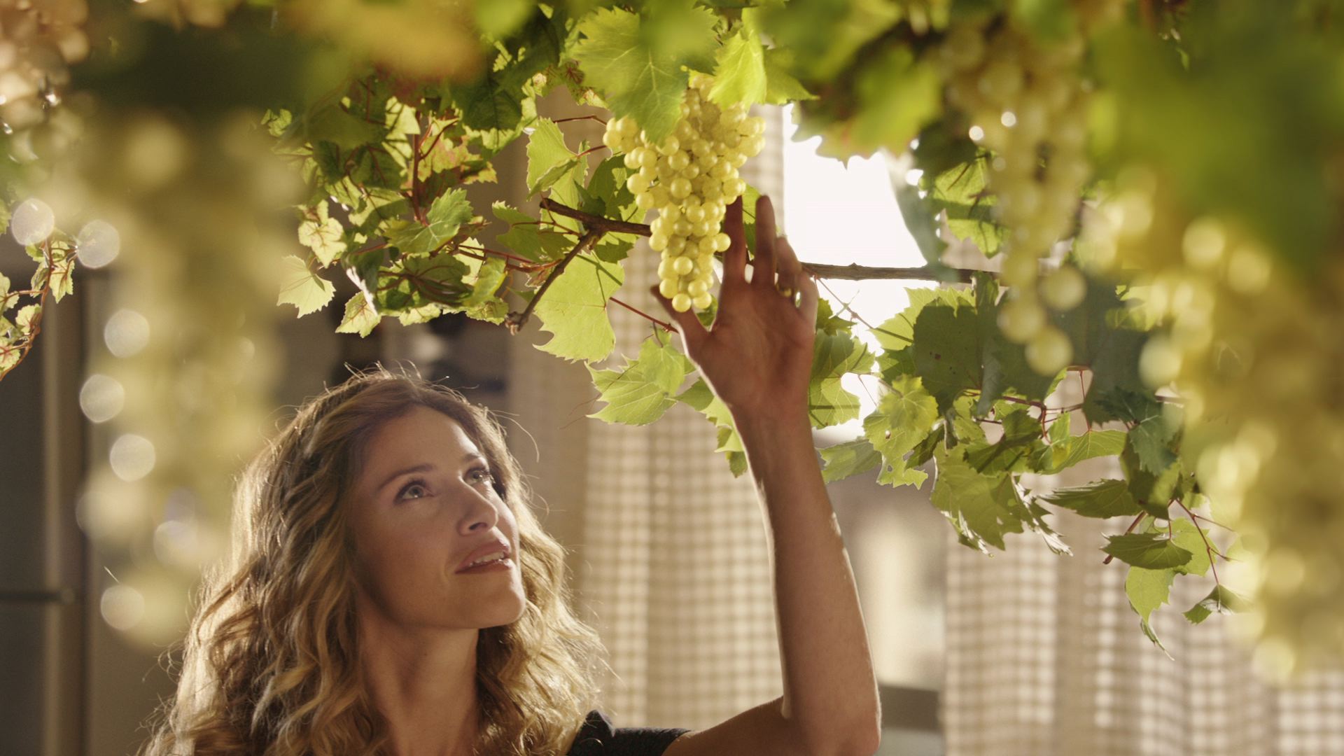
The new Tavernello campaign was created by the Testa agency to describe all the magic and poetry of that great Italian tradition – namely wine. The campaign has been on air on all main national broadcasters and satellite channels since 4 January 2015, starring the ever more authoritative protagonist: Tavernello.

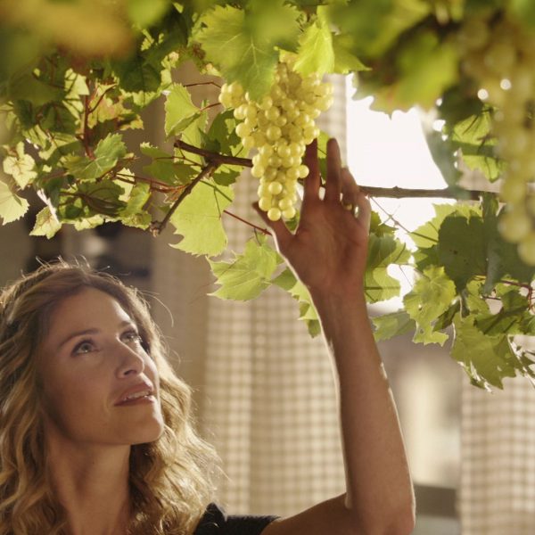
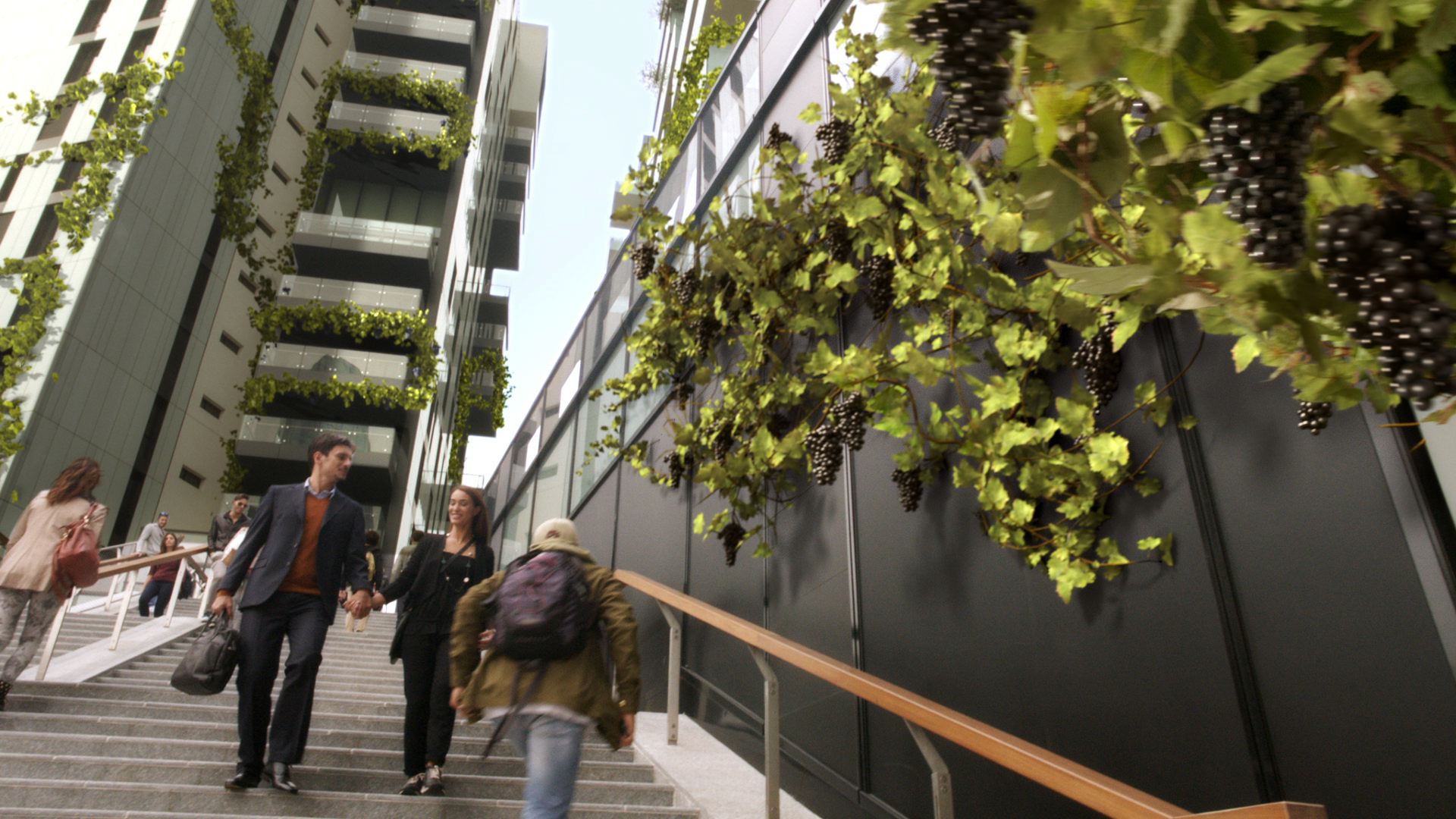
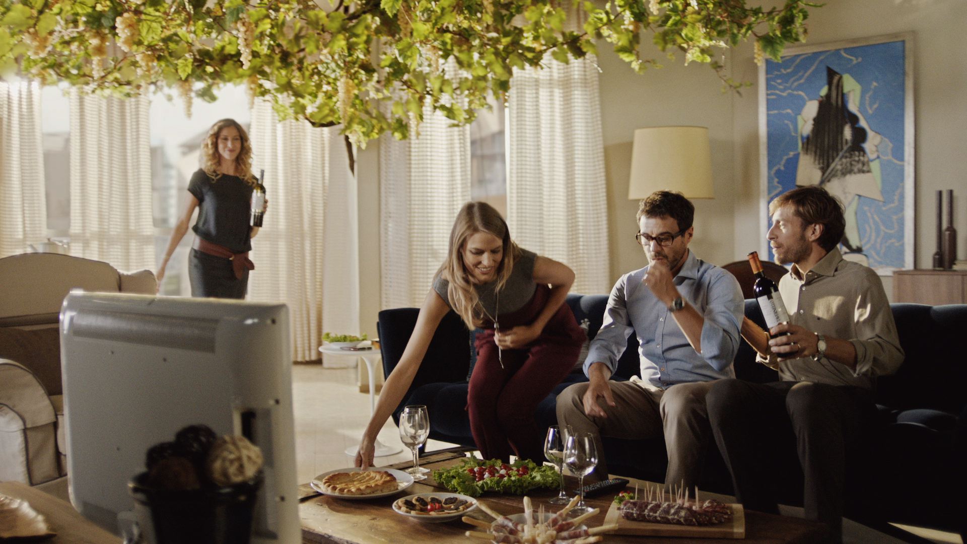
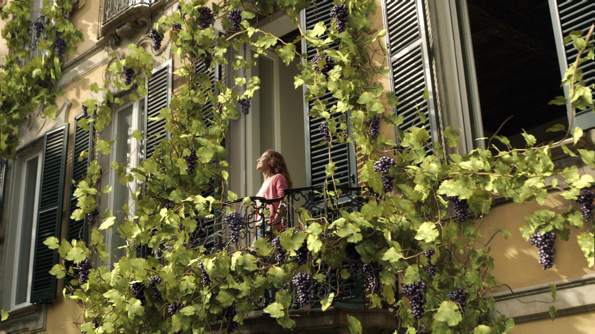
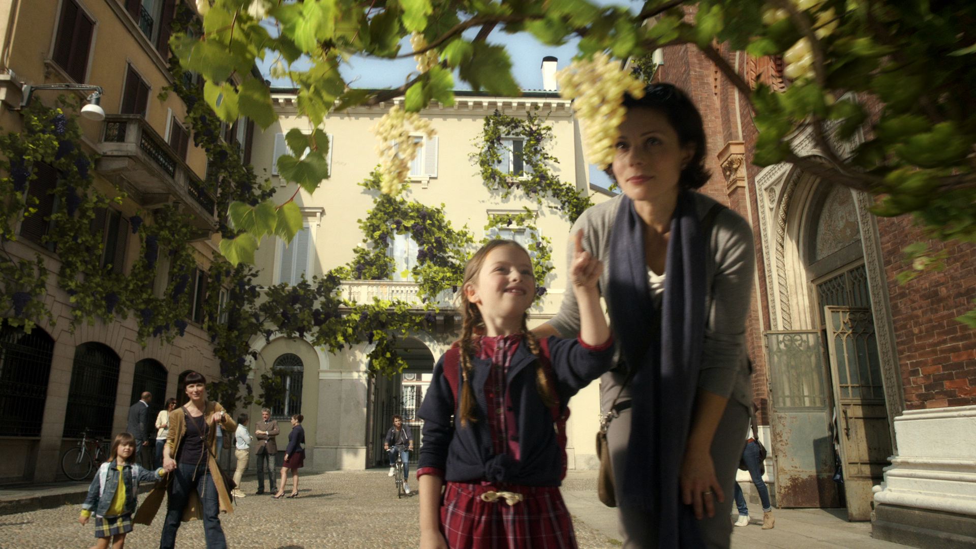
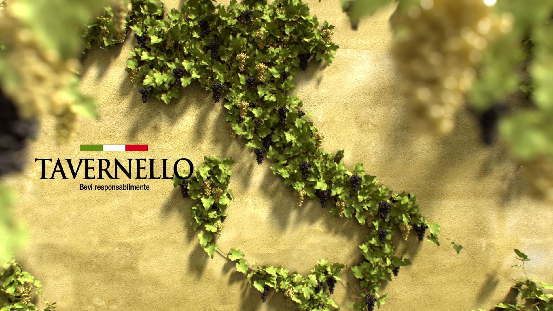
The campaign uses powerful and evocative images of vines as they grow and wonderful bunches of grapes as they get bigger and mature on houses and skyscrapers in an Italian city, to reveal in a simple and memorable way how Italy’s best selling wine arrives in the homes of more and more consumers every day. It brings genuineness, freshness, and all the flavour of a good glass of wine to Italians’ homes: the unique and real taste of moments enjoyed together.

A hand stretches out to pick a bunch of mature juicy grapes, and then the brunch turns into a bottle, this is the key frame to sum up in just once instant all the power and wonder of the grape turning into wine: genuine, good, Italian.

There are two subjects, with cuts of 40”, 30” and15”: the first one presents Chardonnay and Syrah- Cabernet, while the second one is dedicated to sparkling white and rosé. These new wines in bottles flank the historical cartons, demonstrating how the company which is always attentive to the tastes and needs of its consumers is evolving. The new labels bring an elegant and balanced bouquet to the table, with decisive mature flavours and fresh, sparking notes.

With music by Mishaela, and the warm voice of Noa, the images which combine the wonders of the special effects with the realism of routine moments almost stolen by the camera were created by director Dario Piana with Edi for post production. The magic in the city was brought to life bunch by bunch, and one leaf after another.

Production company Little Bull. Creative direction from Piero Reinerio, Monica Pirocca and Michela Sartorio.

Planning by Media Italia.

Posted in Uncategorized

COMMUNICATION CAMPAIGN – COMMITTEE FOR THE EXPOSITION OF THE SHROUD 2015

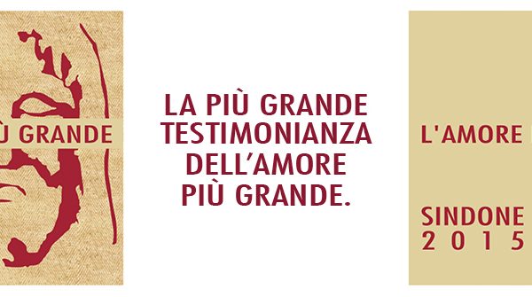
The campaign inviting people to make a free reservation (reservations are mandatory) to visit the Exposition of the Holy Shroud (in Turin from 19th April to 24th June 2015) makes its debut on Sunday 7th December. It focuses on a request made by the Archbishop of Turin, Monsignor Cesare Nosiglia, to bring together the image of Jesus of the Shroud and the motto “The greatest love” (John 15, 13).

Armando Testa was pleased and proud to create the campaign in addition to the logo which has, over recent months, summed up the invitation to reflect on the Shroud as: “The greatest demonstration of the greatest love”.

The campaign, which was planned by Media Italia, the Media Centre of the Armando Testa Group, includes press, dailies and magazines. Particular attention was paid to web development reaching directly those interested and helping them use the site to make their reservation for a visit: “To you for you with the Shroud”.

Creative Director: Piero Reinerio. Art Director: Enrico Ambroggi.

Posted in Uncategorized